
A landing page should do one job: capture leads, book calls, or sell. If yours is taking days of copy rewrites and design tweaks, you are paying a hidden tax in lost speed. An ai landing page builder gets you to a credible first version fast, but conversions come from how you brief it, what you choose to generate, and what you validate before you publish.
What an AI landing page builder is and what it should do
An AI landing page builder uses prompts and structured inputs to generate a landing page’s core building blocks: layout, copy, visuals, and often form logic. The better tools make iteration cheap, so you can respond to real market feedback instead of guessing in a vacuum.
At minimum, expect it to help with:
- Page structure: A sensible section order (hero, benefits, proof, offer, Frequently Asked Questions, final call to action) aligned to one conversion goal.
- Conversion copy: Draft headlines, subheads, benefit bullets, objections, and call to action (CTA) microcopy you can edit without starting from scratch.
- Basic design system: Type scale, spacing, and components that look cohesive on mobile and desktop.
- Lead capture: Forms and integrations that route submissions to your email list, customer relationship management (CRM) system, or calendar.
What you should not expect from “one-click AI”:
- Instant product-market fit: AI can draft words, but it cannot create a compelling offer if the offer itself is weak.
- Automatic trust: Social proof, clear pricing, and credible positioning still depend on the inputs you control.
- Perfect performance by default: You still need to check speed, accessibility, analytics, and tracking.
Choose the right landing page type for your goal
Most landing pages fail because they try to do three jobs at once. Pick one outcome, then build the page around that single action.
Use this as your quick matcher:
| Goal | Best landing page type | Primary CTA | What to measure |
|---|---|---|---|
| Collect leads | Lead magnet page | Download, join, get the checklist | Form conversion rate, cost per lead |
| Book calls | Consultation page | Book a call | Booking rate, show-up rate |
| Sell a simple offer | Product or offer page | Buy now, start trial | Purchase conversion rate, refund rate |
| Validate an idea | Waitlist or pre-launch page | Join waitlist | Signup rate, replies to follow-up |
If you are a founder building a service business, pages that book calls or collect leads are usually the fastest path to revenue.
Prep work that makes AI outputs dramatically better
The fastest way to waste time with an AI landing page builder is prompting before you lock the basics. A tight input doc beats clever prompting every time.
Define one audience and one promise
Write a single sentence you can hand to anyone, including your AI builder.
- Audience: Who is this for, specifically (role, niche, context)?
- Pain: What are they trying to stop or start?
- Promise: What outcome do they get?
- Mechanism: Why should they believe you can deliver it?
Example:
- Audience: Clinic owners with front-desk bottlenecks.
- Pain: No-shows and constant rescheduling.
- Promise: More booked appointments with less admin.
- Mechanism: Automated confirmations, rescheduling, and deposit capture.
Collect the raw inputs AI cannot guess
Put these in a document before you generate anything. This is where your page stops sounding like a template.
- Offer details: Deliverables, timeline, price range, and who is a good fit.
- Proof: Testimonials, logos, and short case notes (use metrics only if they are true and verifiable).
- Objections: “Too expensive”, “I don’t have time”, “Will this work for my niche?”, and “What happens after I sign up?”.
- Constraints: Brand colors, tone, required disclaimers, and any compliance needs.
If you do not have testimonials yet, use alternatives that are still honest:
- Credibility signals: Years in industry, certifications, partnerships, or relevant prior work.
- Process clarity: A clear step-by-step of what happens after signup so the buyer feels safe.
How to build a landing page with an AI landing page builder
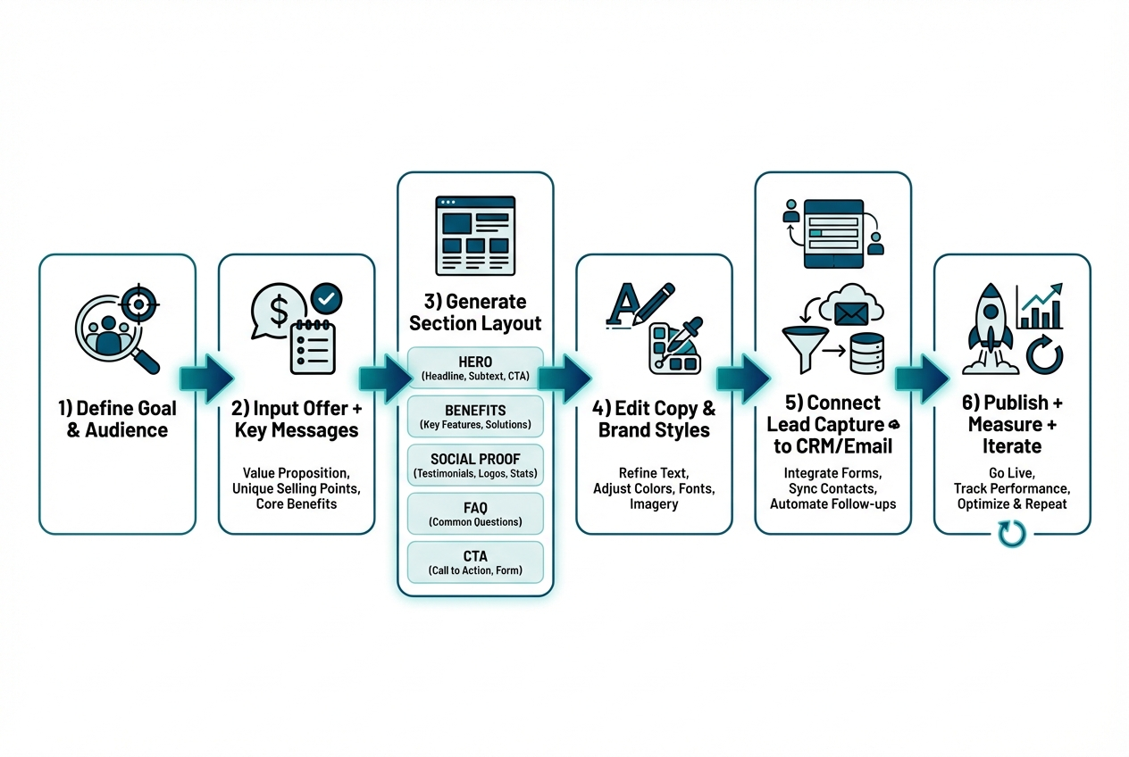
This workflow consistently produces pages that convert, without turning into an endless rewrite loop.
Step 1: Write a one-paragraph brief for the page
Your brief should be short enough to paste into the builder, but specific enough that the output cannot drift into generic “marketing speak”.
Include:
- Conversion goal: The single action the page exists to drive, such as “Book a call”, “Join waitlist”, or “Buy”.
- Audience: The exact segment you want to attract (job title, niche, situation).
- Unique angle: The reason to choose you, such as a mechanism, niche focus, or guarantee.
Step 2: Generate a section outline before generating full copy
Start with structure, then fill the page. This prevents you from fighting the builder’s default layout later.
A high-performing default layout looks like this:
- Hero: Outcome-first headline, supporting subhead, primary CTA, and one credibility signal.
- Problem and stakes: Why this matters now and what it costs to ignore.
- Benefits: 3 to 6 outcomes written in the customer’s language.
- How it works: 3 steps that are simple and concrete.
- Social proof: Testimonials, short results, logos, or credible proxies.
- Frequently Asked Questions: Objections and clarifications.
- Final CTA: Repeat the promise and remove friction.
Step 3: Generate conversion copy section by section
Ask the AI to generate in blocks, not as one huge page. You want control and tighter iteration.
- Hero copy: Request 10 headline options, then choose one you can say out loud without cringing.
- Benefits: Anchor benefits to a time window, workflow, or deliverable so they stay specific.
- Frequently Asked Questions: Tell the AI to include skeptical questions, not soft ones.
Step 4: Apply brand style and visual hierarchy
Treat design as readability and decision-making, not decoration. Your job is to make the page scannable so visitors understand it fast.
- Typography: Use one font family (or two at most) and keep the type scale consistent.
- Spacing: Add whitespace around headlines, sections, and CTAs so the page breathes.
- Buttons: Keep one primary CTA style; secondary CTAs should look clearly secondary.
Step 5: Add lead capture and route submissions
A landing page is only as valuable as the next step it triggers.
- Forms: Keep fields minimal. Name and email is enough for most lead magnets.
- Calendars: If the CTA is “Book a call”, put availability on the page so there is no extra hop.
- Automation: Send submissions to your email tool, CRM, and a notification channel so leads never disappear.
If your landing page needs to do more than collect emails, such as qualify leads, take deposits, or create a client portal, you will get more leverage by building the page as part of a small app rather than a standalone page. QuantumByte is designed for that “landing page plus workflow” reality, turning prompts into real web software using the idea-to-spec approach described on the QuantumByte homepage. It is also the same kind of founder-friendly speed that let comedian Aziz Ansari create an app for his movie “Good Fortune” in minutes, despite having no prior experience building apps.
Step 6: Add tracking before you publish
Do this once and future iterations become obvious, because you can see where people drop.
- Analytics events: Track page views, scroll depth, and conversions (form submit, booking complete, purchase).
- UTM parameters: Standardize tagging across ads, emails, affiliates, and partnerships.
- Heatmaps: Use them when traffic is high enough to learn from behavior patterns, not one-off sessions.
Step 7: Publish, then iterate in tight loops
Treat your first publish as version 1. The goal is learning, not perfection.
- Week 1 fixes: Address obvious clarity issues, missing links, broken forms, and confusing CTAs.
- Week 2 test: Change one thing at a time, usually headline or CTA wording.
- Week 3+ improvements: Adjust offer, proof, and pricing presentation based on lead quality.
Prompt templates that work for landing pages
Copy and paste these into your AI landing page builder and replace the brackets.
Template 1: Full landing page brief
- Audience: [who it is for]
- Pain: [what they are trying to avoid]
- Desired outcome: [what they want]
- Offer: [what you deliver]
- Unique mechanism: [why you can deliver]
- Primary CTA: [book a call / join waitlist / buy]
- Proof available: [testimonials, logos, experience]
- Tone: [direct, premium, friendly]
Now generate:
- Hero variants: A hero section with 10 headline options and 10 subhead options.
- Page structure: A 6-section outline that matches the conversion goal.
- Benefit bullets: Benefits written as specific outcomes, avoiding vague claims.
- Objection handling: A Frequently Asked Questions section that includes skeptical objections.
Template 2: Hero section generator
Generate 10 hero headlines and 10 subheads for:
- Audience: [audience]
- Outcome: [outcome]
- Timeframe or constraint: [optional]
- Differentiator: [differentiator]
Rules:
- No buzzwords: Avoid “revolutionary”, “next-gen”, and empty hype.
- Simple language: Use words your customer would use in a sales call.
- Logical CTA: Make the CTA feel like the next step, not a commitment leap.
Template 3: Objection-first Frequently Asked Questions
Create a Frequently Asked Questions section for this landing page. Include at least 8 questions.
Include:
- Pricing objections: Questions that address cost, value, and what is included.
- Time and complexity objections: Questions that address setup effort and learning curve.
- Industry fit objections: Questions like “Will this work for my niche?”.
- Next-step clarity: Questions that explain what happens after a signup or booking.
If you want more structured prompt patterns beyond landing pages, our AI app builder prompt templates are a practical library for generating screens, workflows, and data models. This becomes useful when your “landing page” is really the front door to booking, onboarding, or a paid portal.
Design and UX essentials that raise conversions
You do not need design awards. You need comprehension and a clear path to the next step.
Focus on these fundamentals:
- Clear value proposition: Say what you do, who it is for, and the outcome within the first screen.
- Single primary CTA: Keep one primary CTA per page state so attention does not split.
- Proof near the ask: Place testimonials, logos, or credible signals close to CTAs.
- Friction reduction: Explain what happens after submission so the process feels safe.
Accessibility is also conversion. If your text is hard to read, you lose buyers.
- Contrast: The Web Content Accessibility Guidelines (WCAG) recommend at least a 4.5:1 contrast ratio for normal text and 3:1 for large text in Success Criterion 1.4.3 Contrast (Minimum).
Technical SEO and speed checks you should not skip
A landing page is often your first impression from search, ads, or referrals. Slow or unstable pages quietly bleed conversions.
Core Web Vitals targets
Google’s Core Web Vitals define “good” thresholds that map to real user experience:
- Largest Contentful Paint (LCP): 2.5 seconds or less.
- Interaction to Next Paint (INP): 200 milliseconds or less.
- Cumulative Layout Shift (CLS): 0.1 or less.
How to measure with PageSpeed Insights
The web.dev guide on how to measure Core Web Vitals notes that PageSpeed Insights reports aggregate performance over the past 28 days, and that field data is used to determine whether a page meets the recommended thresholds.
Landing page SEO basics
Keep this simple and consistent:
- Primary keyword focus: Use your primary keyword in the headline, first paragraph, and a key subheading where it fits naturally.
- Single topic per page: Do not cram your whole product into one landing page.
- Descriptive metadata: Write a title tag and meta description aligned to the page promise.
- Fast media: Compress images, use modern formats, and avoid layout shifts.
When you should use an app builder, not a basic landing page tool
Tools like Unbounce, Leadpages, Wix, Webflow, and Framer are solid when you only need a page and a form.
In our opinion, the moment your landing page needs to trigger a real workflow, you should switch from “page builder thinking” to “app builder thinking”. Otherwise you end up stitching together tools, paying for overlap, and debugging handoffs that should have been one system.
You are in app builder territory when you need:
- Qualified lead routing: Different paths based on answers (and different follow-up actions).
- Scheduling plus deposits: Booking tied to payment, policies, and automated reminders.
- Client portals: A secure place for updates, uploads, invoices, or deliverables.
- Internal operations: A lightweight system your team uses daily after the lead comes in.
If you want to explore this approach before you commit to a build, our perspective on vibe coding workflows and the broader landscape of vibe coding tools can help you understand the “iterate fast, ship real software” mindset behind modern AI builders.
A founder-friendly way to ship your landing page and the workflow behind it
If your landing page is meant to do more than collect emails, you will get better leverage from a builder that treats the page as part of a system.
our approach is built around speed, templates, and natural-language prompting. You can get to a usable first version quickly and still customize what matters. This matters most when the landing page is only the first step of a larger productized flow, like onboarding, scheduling, and fulfillment.
- Founder-friendly: You can describe what you want in plain language and iterate without waiting on a developer.
- Business-friendly templates: Common building blocks reduce setup time, but you still control the final workflow.
- Two-tier path: Start lightweight with our basic plans and move to the Enterprise offering when you need deeper automation.
Wrap-up: what you now have
You now have a practical, founder-friendly process to use an ai landing page builder without getting stuck in vague prompts or endless tweaks.
You covered:
- Choosing the right page type: Match the page to one conversion goal so the CTA stays clear.
- Preparing better inputs: Gather offer details, proof, objections, and constraints so AI outputs sound like you.
- Building step by step: Move from brief to outline to block-by-block copy, then integrate forms and tracking.
- Using prompt templates: Generate headlines, structure, and objection-handling Frequently Asked Questions faster.
- Protecting conversions: Apply UX, accessibility, and performance checks before you scale traffic.
- Knowing when to upgrade: Switch to an app builder approach when the page must drive real workflows.
Frequently Asked Questions
Is an AI landing page builder good for SEO?
It can be, as long as you control the page’s focus and quality. Keep one topic per page, write clear headings, and validate speed and stability. AI should accelerate drafting, not replace keyword strategy or technical checks.
What should I generate with AI vs write myself?
Generate first drafts of structure, headline variations, benefit bullets, and objection-first Frequently Asked Questions. Write or heavily edit your unique mechanism, proof, pricing logic, and any claims that require accuracy and credibility.
How long should a landing page be?
As long as it needs to be to remove doubt and earn the click. For cold traffic, longer pages with proof and Frequently Asked Questions often outperform short pages. For warm traffic, shorter pages can work if the offer is already understood.
Do I need A/B testing to get results?
Not immediately. Start by fixing clarity issues and ensuring tracking works. Once you have steady traffic, test one change at a time, usually headline, CTA wording, or proof placement.
When does it make sense to use QuantumByte for a landing page?
When your landing page is the front door to a workflow, not just a form. If you need booking, qualification flows, portals, or internal automation behind the page, QuantumByte’s app builder approach is a better fit than stitching together multiple tools.