
You want a landing page that converts fast, without wrestling with blank-page copywriting or a brittle template. An ai landing page generator can get you to a credible first draft in minutes, but results only get reliably high-converting when you steer the inputs, structure, and validation like a builder.
What an AI landing page generator should produce
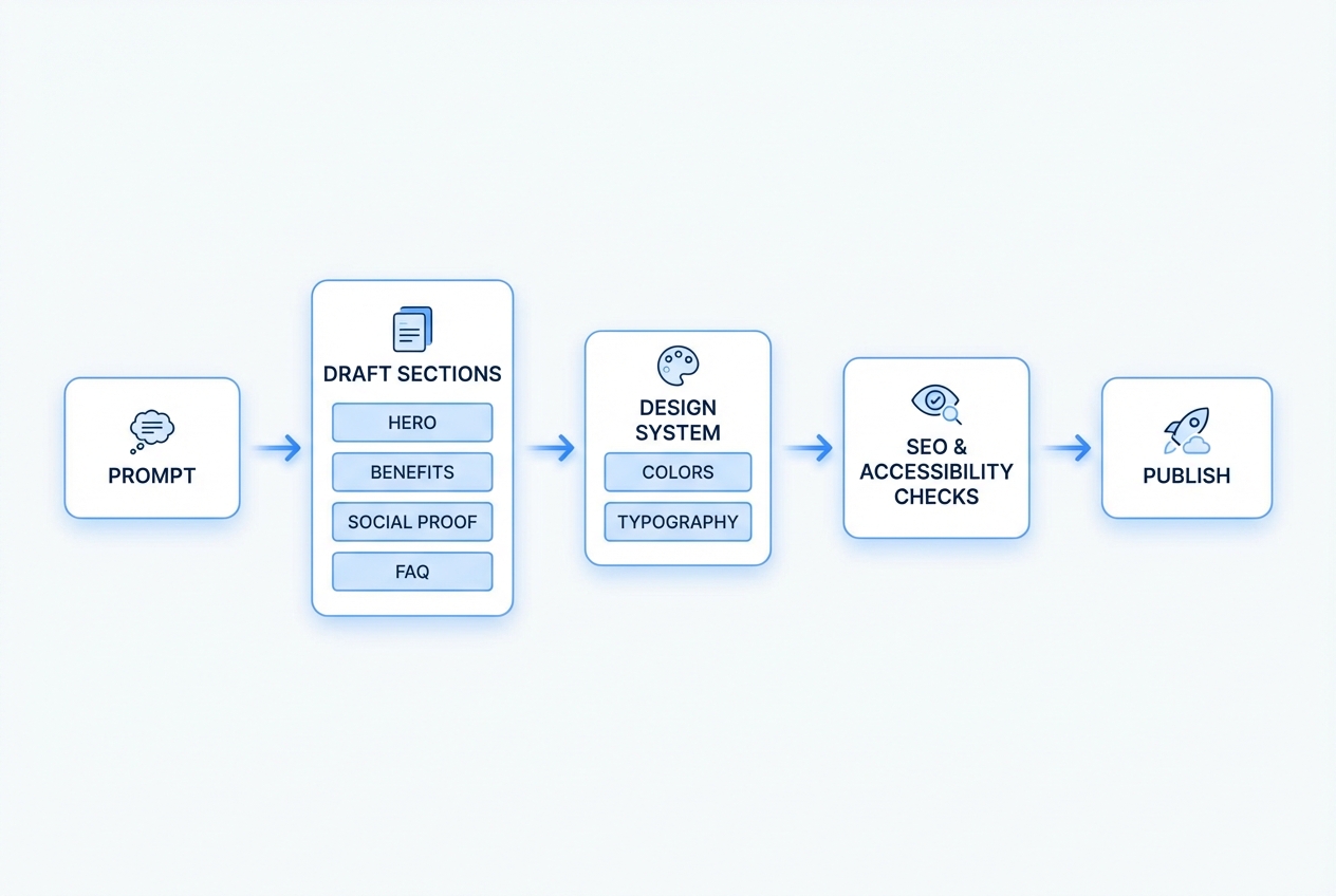
An AI landing page generator is most valuable when it does more than write copy. You want a tool that can consistently output a complete page system: offer clarity, persuasion, layout structure, and the foundations for search and performance.
Look for these outcomes.
- A clear above-the-fold promise: A headline, subheadline, and primary Call to Action (CTA) that says who it is for, what it does, and what happens next.
- A conversion-first section order: A sensible flow such as hero → benefits → proof → use cases → objections → CTA repetition.
- Message match for traffic: Copy variants that align with where the visitor came from (ads, social, search intent, partner links).
- On-brand design direction: Color, typography, spacing, and component suggestions that translate into a consistent layout.
- SEO and accessibility basics: Page title suggestions, heading hierarchy, readable contrast, and usable form labels (not “pretty placeholders”).
- Iteration support: Easy ways to generate variants for offers, CTAs, and objections so you can test without rebuilding.
If your “generator” only outputs a headline and a paragraph, you are still doing most of the hard work.
When AI is the right tool vs templates vs custom builds
AI is not automatically better. The right choice depends on your speed needs, your differentiation, and how much you plan to evolve the page.
| Approach | Best for | Strengths | Watch-outs |
|---|---|---|---|
| AI landing page generator | New offers, fast validation, frequent iteration | Fast drafts, rapid variant generation, can adapt messaging to an Ideal Customer Profile (ICP) | Needs strong inputs; can produce generic claims if you do not constrain it |
| Template builder | Simple offers with stable messaging | Predictable layout, easy publishing | Your page can look like everyone else; customization often hits a wall |
| Custom code or custom design | High-stakes funnels, unique interaction, complex analytics | Full control, tailored performance | Time and cost; slower iteration unless you have a tight process |
A practical founder rule: use AI to get to a publishable v1 quickly, then invest in deeper craft only after you have real traffic and real objections.
The workflow that consistently produces a strong AI landing page
Most teams fail with AI landing pages for one reason: they treat the prompt as a specification rather than a request.
Use a simple loop:
- Context: ICP, problem, trigger, competitor alternatives.
- Offer: What you sell, how it works, what the visitor gets.
- Proof: What you can legitimately claim, and what you cannot.
- Friction: The objections you expect and how you will answer them.
- Constraints: Voice, length, compliance notes, and page goals.
Once you can express those five pieces, AI becomes a multiplier.
How to use an AI landing page generator to build a page that converts
This is the calm, repeatable process that works whether you publish on a website builder, a no-code platform, or a custom stack.
1) Start with one conversion goal and one visitor intent
If your landing page tries to do everything, it will convert at nothing.
Decide the single action you want:
- Book a call: Use this when sales requires context, qualification, or a tailored recommendation.
- Start a free trial: Use this when your product onboarding is strong and you can prove value quickly.
- Join a waitlist: Use this when the offer is not fully live yet and you need demand validation.
- Buy now: Use this when pricing and packaging are simple and objections can be handled on-page.
- Request a quote: Use this when scope varies and you need a few details to price responsibly.
Then define the visitor’s intent in one line:
- Shopping options: The visitor is comparing alternatives and needs clear differentiation and proof.
- Urgent pain: The visitor needs a fix now and responds to speed, clarity, and low-friction CTAs.
- Research first: The visitor wants to learn before committing and needs education plus gentle next steps.
This intent drives section order and CTA wording.
2) Write your “inputs” before you write your page
Do this first, even if you are using the best ai landing page generator on the market.
- Ideal Customer Profile (ICP): Job title, company type, situation, what they care about.
- Primary pain: The costly problem they already feel.
- Trigger moment: Why they are searching today.
- Desired outcome: What “success” looks like in their language.
- Offer: What you sell, what’s included, and how it is delivered.
- Proof you actually have: Testimonials, numbers you can defend, recognizable logos you are allowed to show, or credible process guarantees.
If you want a structured way to turn these inputs into something buildable, borrow the spec-first mindset from our approach to prompts and product requirements in its guide on AI app builder prompts. Even for a simple landing page, structure beats inspiration.
3) Generate the page structure before generating copy
Ask AI for a page blueprint first. Focus on generating a persuasive outline rather than polished prose.
Include constraints in the prompt:
- Target length: “One-scroll version” or “long-form version.”
- Voice: Confident, direct, no hype.
- Claims policy: No fabricated statistics. No “industry-leading” fluff.
- Sections required: Hero, benefits, proof, objections, CTA, FAQ.
Your goal is to get a map you can edit.
4) Generate copy section-by-section, not all at once
When you generate everything in one pass, you get repetition and vague promises.
Generate in chunks:
- Hero: 5 headline options + 3 subheadline options + 3 CTA button labels.
- Benefits: 3 to 6 benefits, each with a concrete example.
- Use cases: 3 scenarios written in the visitor’s language.
- Objections: At least 5 and concise answers.
- FAQ: Questions that match what people actually ask before committing.
Then edit for message match. If you are sending paid traffic, your ad and your hero section must feel like the same conversation.
5) Force specificity with “proof anchors”
AI is good at sounding confident. You need it to be accurate.
Use proof anchors in your prompt:
- Only use claims from this list: Paste the exact claims you can support.
- If proof is missing, write it as a process guarantee: For example, “Get a plan in 24 hours” is a promise you can keep. “Increase conversions by 40%” is often not.
- Include limitations: This makes the copy more believable and reduces refunds.
6) Design the page like a system, not a collage
Even a strong copy draft can fail if the visual hierarchy is weak.
Lock these elements early:
- Type scale: Heading size, body size, line height.
- Spacing: Consistent padding and section rhythm.
- CTA styling: One primary button style, one secondary.
- Component rules: Reusable cards for benefits, consistent testimonial blocks.
If you are moving beyond a landing page into an actual product flow, QuantumByte’s platform is useful here because it treats what you build as an evolving product, not a one-off page. The same publish loop you use for a landing page can later become a portal, scheduling flow, or internal tool, using the same “concept → develop → publish” sequence on Packets.
7) Make the CTA frictionless and measurable
A landing page CTA represents the entire commitment path, far exceeding the role of a simple button.
- Form length: Ask only what you will use immediately.
- Field labels: Use clear labels and instructions, not placeholder-only forms.
- Error handling: Tell people how to fix errors, not just that they failed.
- Confirmation state: Say what happens next, and when.
If you want your page to be broadly usable, align with accessibility basics like descriptive labels and sufficient contrast. The WCAG 2.2 quick reference is a practical checklist for what “accessible enough” means in concrete terms.
8) Add trust in layers, not as a single section
Most founders wait too long to add credibility.
Use layers:
- Micro-proof near the hero: A short credibility line, a simple metric you can defend, or a clear guarantee.
- Mid-page proof: Testimonials, logos (only if you have permission), or short case snippets.
- Late-stage reassurance: Security notes, refund policy, onboarding steps, response times.
If you do not have testimonials yet, do not fake them. Use process clarity instead: steps, timelines, and what you deliver.
9) Build in performance from the start
Landing pages lose conversions when they feel slow or unstable.
Use Core Web Vitals as your practical benchmark. The web.dev guide on Core Web Vitals thresholds defines “good” as:
- Largest Contentful Paint (LCP): 2.5 seconds or less
- Interaction to Next Paint (INP): 200 milliseconds or less
- Cumulative Layout Shift (CLS): 0.1 or less
You do not need to obsess over every point. You do need to avoid obvious traps: oversized hero images, heavy video backgrounds, too many tracking scripts, and layout shifts from late-loading fonts.
10) Publish, then iterate with real objections
Your first version is not your final version.
What to measure in the first week:
- Scroll depth: Are people even reaching proof and FAQ?
- CTA click-through: Are they interested enough to act?
- Form completion rate: Are they dropping at the last step?
- Top questions in replies: These become your next FAQ entries.
If you are building an entire “landing page + onboarding” experience, it helps to think like a product team early. QuantumByte’s content on shipping quickly and then tightening quality is a useful mindset shift, especially the transition advice in what comes after vibe coding.
Prompt templates that work for landing pages
Steal these prompts and adjust the bracketed parts. The goal is to get structured output you can edit.
Landing page blueprint prompt
- Goal: Generate a complete landing page outline for conversion.
- Prompt inputs:
- Audience: [job title / segment]
- Pain: [pain]
- Trigger moment: [why now]
- Offer: [what you sell]
- Primary CTA: [book call / trial / waitlist]
- Proof available: [testimonials / numbers / process]
- Constraints: No hype. No invented stats. Short sentences. Clear headings.
- Output: Section list in order, with 1–2 lines describing what each section should say.
Hero copy prompt
- Task: Write 10 headline options and 5 subheadline options for a landing page.
- Headline requirements: Each headline must include: [audience] + [outcome] + [time-to-value or method].
- Banned words: Avoid these banned words: “revolutionary,” “cutting-edge,” “best-in-class,” “game-changing.”
- CTA labels: Provide 6 CTA button labels, half direct-response, half low-commitment.
Objections and FAQ prompt
- Objections list: List 12 objections a skeptical buyer would have about [offer].
- Honest answers: For each objection, write a 2–3 sentence answer that is honest and specific.
- FAQ rewrite: Then rewrite the top 8 as FAQ questions with concise answers.
Comparing popular AI landing page tools
Different tools optimize for different parts of the job: copy, layout, publishing, or a full product flow.
| Tool type | Examples | Where it shines | Where it breaks |
|---|---|---|---|
| AI copy generators | Copy-focused tools | Fast headline and section drafts | You still need layout, publishing, and performance discipline |
| AI website builders | Page builders with AI | Quick site creation and hosting | Harder to evolve into a real product experience beyond the page |
| Design-led AI builders | UI-first tools | Strong visuals quickly | Messaging can lag if your offer is complex |
| Build-a-product platforms | AI app builders | Landing page plus the workflow behind it | Requires you to think in “flows,” which is a benefit if you plan to scale |
If your landing page is a step toward productizing a service or validating a software idea, a build-a-product approach can be the most efficient. It is the same logic recommended in QuantumByte’s roadmap that starts with validating demand using a page before building deeper software in its guide to building a passive income app.
From an editorial standpoint: for founders, the best tool is the one that does not trap you. You want speed now and flexibility later.
Where QuantumByte fits for landing pages
If all you need is a single marketing page, you can use many tools. QuantumByte becomes especially relevant when your landing page is the front door to something bigger: a customer portal, scheduling flow, onboarding, internal operations, or a paid workflow.
Three practical reasons founders choose it:
- Founder-friendly build loop: The platform is built around turning an idea into structured documentation and then into a working experience, which reduces the “what do I do next?” gap. Start with a basic plan and evolve from there.
- Templates without the template trap: Pre-built building blocks get you moving, but you can still change the parts you need as your offer sharpens.
- Speed with real flexibility: You can iterate quickly without locking yourself into a brittle page setup. Even non-technical creators have used it to ship quickly, including Aziz Ansari building an app for his movie “Good Fortune” within minutes.
If you are building for a larger organization with governance, centralized control, and cross-functional automation needs, the right fit is the QuantumByte Enterprise offering.
If you want the shortest path to a publishable first version, start with our basic plans. It is founder-friendly, ships fast, and stays flexible when your “one page” inevitably turns into a workflow.
Common mistakes that make AI-generated landing pages underperform
These are fixable. Most come from skipping one step in the process.
- Generic claims: AI will default to broad promises. Replace them with specific outcomes, constraints, and examples.
- Too many CTAs: Pick one primary action. Secondary actions are fine, but do not compete with your main goal.
- No message match: If the visitor clicked “AI scheduling for clinics,” your hero cannot say “All-in-one business solution.”
- Weak proof: Trust cannot be an afterthought. Add proof layers early, even if it is process proof.
- Ignoring accessibility: Poor contrast and unlabeled forms silently kill conversions for real users. Use the WCAG 2.2 quick reference as your baseline.
- Shipping without iteration: Publishing is the midpoint. Your best page is version five, not version one.
A quick wrap-up of what you now have
You now have a practical, step-by-step way to use an ai landing page generator without ending up with generic copy or a flimsy page.
You covered:
- Choosing the right build approach: How to decide whether AI, templates, or custom builds fit your situation.
- Generating structure, then copy, then design: A workflow that prevents repetitive sections and vague promises.
- Building trust and reducing friction: How to add proof layers, tighten your CTA path, and remove unnecessary form barriers.
- Protecting conversion with fundamentals: Performance and accessibility baselines that prevent avoidable drop-offs.
- Picking tools that scale with you: How to choose based on whether you are building just a page or a full product flow.
Frequently Asked Questions
Can an AI landing page generator replace a copywriter?
It can replace the first draft and speed up iteration. It does not replace strategy. The best results come when you supply the ICP, real objections, and proof you can actually support, then use AI to generate and refine variants.
How long should an AI-generated landing page be?
As long as it needs to be to answer objections. For warm traffic, a short page can work. For cold traffic or higher-priced offers, long-form usually performs better because it has space for proof and reassurance.
What should I put above the fold?
A clear promise, who it is for, the primary benefit, and one primary CTA. Add a small line of credibility if you have it, such as a guarantee, a constraint, or a simple proof point.
Is performance really a conversion issue, or just an SEO issue?
It is both. Slow pages reduce trust and increase drop-offs. Use Core Web Vitals as a practical guide, including the thresholds defined by web.dev in its article on Core Web Vitals thresholds.
When does it make sense to use QuantumByte for a landing page?
When your landing page is the start of a bigger workflow. If you plan to add onboarding, a portal, scheduling, or an internal tool behind the page, building in a platform designed for end-to-end flows can save you multiple rebuilds later. Start with our basic plans and evolve as you learn.