
You can have great reviews and a busy clinic, then watch new patient demand stall because your website sends people on a scavenger hunt. A high-performing dentist landing page fixes that by giving one clear path: understand the offer, trust the practice, book the appointment.
What a dentist landing page is meant to do
A dentist landing page is a single, focused page designed to convert one traffic source (Google Ads, Local Service Ads, a social post, a referral link, an email) into one action (usually a call or an appointment request).
Think of it as a focused conversion page that sits alongside your main website, with one job: drive a call or appointment request.
Key outcomes to optimize for:
- Fast decision-making: You answer the top questions (cost signals, insurance, availability, location) without making visitors dig.
- High trust: You reduce anxiety with proof (reviews, credentials, photos, policies).
- Low-friction booking: You make it easy to call, request an appointment, or message, especially on mobile.
Choose one conversion goal and one offer
If you try to make one page work for every procedure, you end up with vague copy and weak intent. Start by choosing a single primary offer and write the entire page around it.
Common dentist landing page offers that convert well:
- New patient exam and X-rays: Best for general dentistry demand capture.
- Emergency dentist, same-day: Best for high-intent local search and ads.
- Clear aligners consultation: Best for cosmetic and orthodontic intent.
- Dental implants consultation: Best for higher-value leads, with stronger qualification.
How to pick the right offer:
- Match traffic intent: If your ad says “Emergency dentist,” the page must feel like emergency dentistry from the first screen.
- Keep qualification simple: If you have requirements (insurance accepted, age limits, sedation availability), state them clearly to reduce wasted calls.
- Avoid bait pricing: If you mention pricing, make it honest and specific about what it includes.
Dentist landing page structure that reliably converts
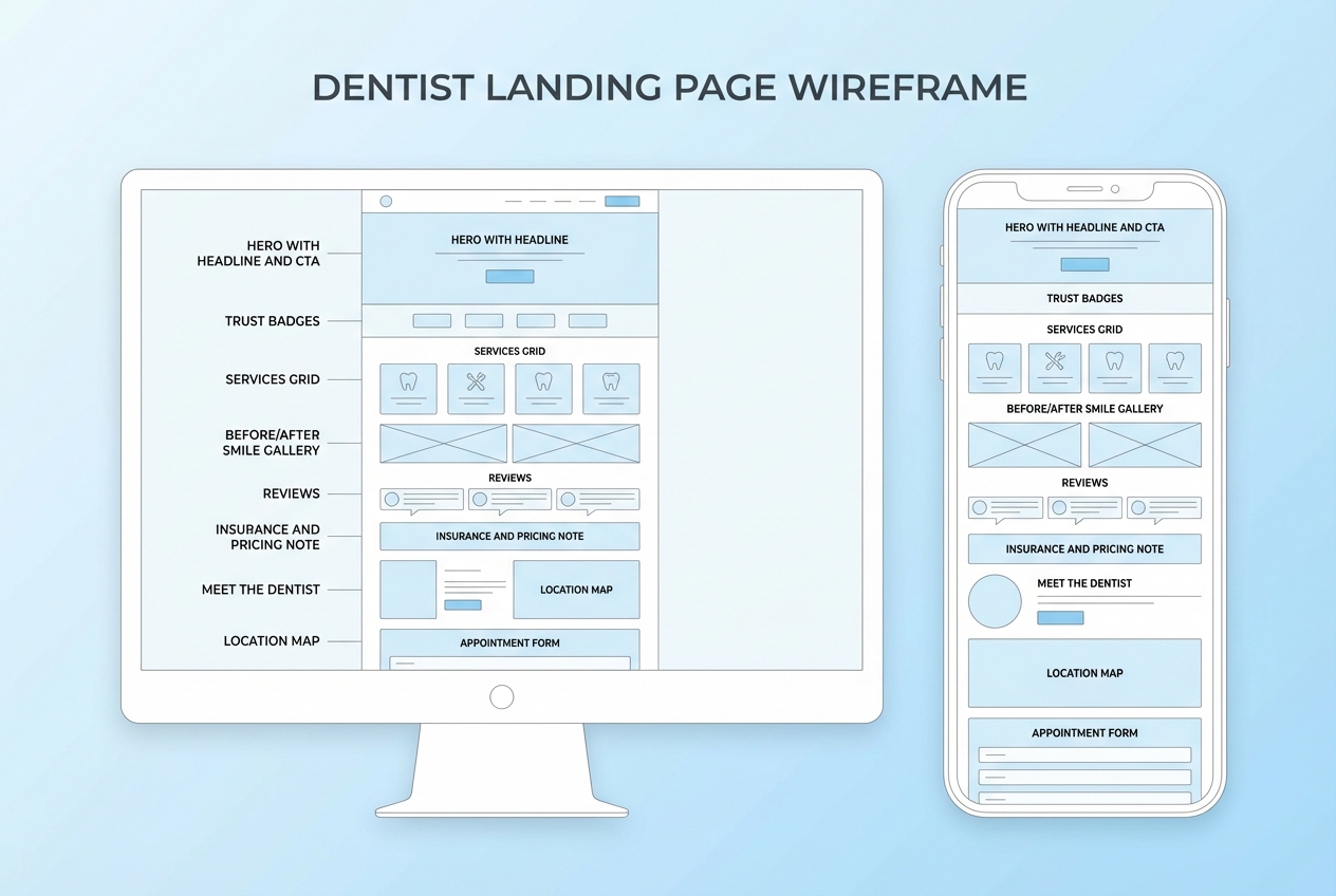
The simplest way to build a high-converting page is to think in blocks. Each block removes one reason someone might not book.
Recommended page blocks (top to bottom):
- Hero section: One clear promise, one primary call-to-action (CTA), and immediate reassurance.
- Trust strip: Reviews rating, associations, years in practice, financing, and insurance signals.
- Problem-to-solution: Speak to the pain (toothache, embarrassment, anxiety) then your approach.
- Services snapshot: A short list of what the offer includes, not your full menu.
- Proof: Reviews, before-and-after (where appropriate), real clinic photos.
- Meet the dentist: Calm authority, credentials, and bedside manner.
- Logistics: Location, hours, parking, what to bring, what to expect.
- Booking section: Repeated CTA with form and click-to-call.
- Footer essentials: Contact details, policies, and compliance links.
A useful mental model:
- Above the fold: Make the decision feel safe.
- Mid page: Make the decision feel reasonable.
- Bottom: Make the decision feel easy.
Write landing page copy that sounds human and books appointments
Dental visitors are often anxious. Your copy should reduce fear and decision fatigue, not “sell.”
Use these copy rules:
- Lead with outcomes, not procedures: People want relief, confidence, and clarity.
- State what happens next: Tell them exactly how booking works and what to expect.
- Avoid clinical overload: A landing page is not a treatment plan.
Copy templates you can adapt:
- Hero headline: “Same-day emergency dental appointments in [City].”
- Hero subhead: “Call now or request a time online. We’ll confirm quickly and get you comfortable.”
- CTA button: “Request an appointment” or “Call the clinic.”
- Reassurance line: “Transparent pricing guidance. Most major insurance accepted.”
High-trust microcopy that reduces drop-offs:
- Response time promise: “We confirm requests during office hours.”
- Privacy reassurance: “Your information is handled securely.”
- No-pressure tone: “Tell us what’s going on. We’ll recommend next steps.”
Design the page for mobile-first, not desktop-first
Most dental traffic is mobile. A page that looks fine on a big monitor can still fail on a phone.
Design decisions that move conversions:
- Sticky click-to-call: Keep a phone CTA visible as users scroll.
- Big tap targets: Buttons and form fields should be comfortable to use with one thumb.
- Short sections: Use clear headings, short paragraphs, and scannable lists.
Common layout mistakes to avoid:
- Carousel heroes: They dilute the message and bury the CTA.
- Pop-ups that block content: They frustrate users and can harm ad destination experience.
- Generic stock imagery: Real photos of your team and clinic build trust faster.
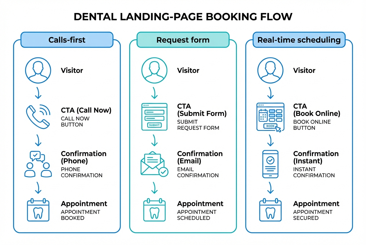
Build the booking flow so your landing page can actually convert
A landing page without a reliable booking path is just a brochure.
You have three practical options:
- Calls-first flow: Best for emergency and high-intent offers. Keep the phone number prominent and track call conversions.
- Request form flow: Best for new patient offers and consults. Keep it short and confirm quickly.
- Real-time scheduling flow: Best when your calendar operations can support it. It reduces back-and-forth and after-hours leakage.
What your booking flow should capture (keep it minimal):
- Contact basics: Name, phone, email.
- Reason for visit: A short dropdown or one open field.
- Preferred times: Two options is enough.
- Consent: A checkbox for contact permissions (especially for text reminders).
If you want a landing page that goes beyond a form, this is where QuantumByte fits naturally. Instead of stitching together a page builder, a scheduling tool, and intake forms, you can use QuantumByte to generate a simple patient-facing booking app and an internal workflow in the same build, then refine it with plain-English prompts. Our straight-forward pricing plans make it easy to get started.
Related build ideas you can adapt:
- Clinic scheduling pattern: Use the “clinic scheduling” approach from our guide on clinic scheduling automation if your front desk is overloaded.
- White-label scheduling pattern: Use the “booking/scheduling” approach from the white-label scheduling category if you want to productize your booking experience.
Make the page compliant with privacy, accessibility, and ad policies
Dental marketing sits close to sensitive information. Treat compliance as part of conversion, because trust is part of conversion.
HIPAA considerations for forms and tracking
If your landing page collects or transmits health information, you may be dealing with protected health information (PHI). The Health Insurance Portability and Accountability Act (HIPAA) Privacy Rule requires covered entities to provide a Notice of Privacy Practices and to make it available, including posting it prominently on websites that provide information about services. The U.S. Department of Health & Human Services provides model notices of privacy practices.
Practical implementation:
- Keep intake minimal on the landing page: Collect only what you need to route the appointment.
- Be careful with pixels and analytics: Avoid sending symptom details or treatment interests in URLs or event names.
- Link the right policies: At minimum, your page should link to privacy information and ways to contact the practice.
Accessibility basics you can implement quickly
Accessibility improves usability for everyone, and it reduces risk. The Web Content Accessibility Guidelines (WCAG) 2.2 quick reference is the most useful checklist-style source for implementation details, including text alternatives, keyboard access, and contrast. Use the WCAG 2.2 Quick Reference to audit your page.
High-impact accessibility fixes:
- Alt text on images: Describe what the image shows (team photo, operatory, smile example).
- Contrast and font size: Make sure text is readable in bright daylight on phones.
- Labels on form fields: Don’t rely on placeholder text as a label.
Google Ads destination requirements
If you run paid traffic, your landing page must meet Google Ads destination requirements. Google’s policy explains that ad destinations must be functional, useful, and easy to navigate. Review Google’s Destination requirements before scaling campaigns.
What to do on the page:
- Make navigation predictable: Don’t trap users in overlays.
- Keep the page working on mobile: Broken mobile experiences can get ads disapproved.
- Match the ad promise: “Same-day emergency” must be supported by your content and operations.
Improve speed and page experience without getting lost in tech
A slow page leaks patients. You do not need perfection, but you do need competence.
Google’s Core Web Vitals provide target thresholds for user experience. Aim for the “good” range for Largest Contentful Paint (LCP), Interaction to Next Paint (INP), and Cumulative Layout Shift (CLS) as defined in Google’s Core Web Vitals guide on web.dev.
High-leverage speed fixes:
- Compress images: Dental photos are heavy. Resize them for web and use modern formats when possible.
- Limit third-party scripts: Every widget adds latency and risk.
- Stabilize layout: Reserve space for images and embedded maps to prevent content shifting.
Add tracking you can trust, then iterate
You cannot optimize what you cannot measure. But in healthcare-adjacent marketing, you also cannot casually collect everything.
Track these basics first:
- Call conversions: Use a tracked number for paid campaigns.
- Form submissions: Track a clean “thank you” event without embedding sensitive details.
- Appointment confirmations: If you can connect scheduling to outcomes, even better.
Iteration loop that actually works:
- Start with the hero: Headline, reassurance line, and CTA.
- Then fix friction: Form length, confusing insurance copy, unclear availability.
- Then test proof: Which review snippets and photos reduce anxiety fastest.
A practical build plan you can execute this week
This is a calm, realistic sequence that gets you live fast, then improves quality.
Step 1: Pick one offer and one audience
Start by choosing one offer (emergency, new patient, implants, or aligners) and one audience segment in your local market. The “why” is simple: clarity converts. When your headline, proof, and booking path all point to the same intent, you remove the mental work that causes people to bounce.
The outcome you’re aiming for is a page that feels instantly relevant. Someone who searched “emergency dentist near me” should not have to interpret your site to understand you can help.
Step 2: Draft the page blocks as a story
Use the block structure above and write short copy for each section. Keep each block focused on one job: reduce anxiety, answer a question, or remove friction.
The outcome is a complete first draft you can ship. Don’t wait for perfect wording. You are building a system you can iterate on once you have real traffic and real objections.
Step 3: Build the booking path to match your operations
Decide whether you are calls-first, form-first, or true scheduling. The “why” matters here. If you promise real-time availability but your team can’t support it, you create a trust break that hurts conversion and reviews.
The outcome is a booking experience that actually completes. That means a short form (or a clear phone CTA), a predictable confirmation message, and a handoff your front desk can execute without guessing.
Step 4: Add proof and real photos
Replace generic imagery with real clinic and team photos, and add review snippets that match the offer. Emergency pages benefit from reassurance and speed proof. Implants and aligners benefit from credibility, process clarity, and outcomes.
The outcome is trust without extra words. People decide fast in healthcare. Visual proof and specific testimonials do a lot of heavy lifting.
Step 5: Add compliance links and accessibility basics
Treat compliance and accessibility as conversion fundamentals. Add privacy information, make contact options obvious, ensure readable type, and label form fields.
The outcome is lower risk and higher completion rates, especially on mobile where small usability issues quickly become drop-offs.
Step 6: Launch and measure, then improve one block at a time
Get live, track calls and submissions, then improve the page in small moves. Start with the hero (headline, reassurance, CTA). Then work down the page, fixing the friction that shows up in recordings, calls, and staff feedback.
The outcome is compounding gains. One clear improvement each week beats a big redesign that never ships.
Dentist landing page checklist in one table
Use this as a quality bar when reviewing your page before you send traffic.
| Section | Goal | What to verify | Common mistake |
|---|---|---|---|
| Hero | Get the right patient to act | One offer, one CTA, phone visible on mobile | Vague headline and multiple CTAs |
| Trust strip | Reduce anxiety fast | Reviews, credentials, insurance signals | Trust elements buried mid-page |
| Offer details | Make value concrete | What’s included, what happens next | Overly clinical explanations |
| Proof | Validate quality | Real reviews, real photos, relevant cases | Stock photos and anonymous testimonials |
| Meet the dentist | Build authority and comfort | Credentials and tone that feels human | Long bio with no patient benefit |
| Logistics | Remove friction | Location, hours, parking, policies | Missing hours or unclear service area |
| Booking | Convert | Short form, confirmation expectations | Form too long or no clear next step |
| Footer | Trust and compliance | Contact methods, privacy information | Missing or hard-to-find contact info |
Where to go next
At this point you have a complete blueprint for a dentist landing page: a single offer, a block-by-block structure, copy that reduces anxiety, a booking flow that matches your operations, and the compliance and performance guardrails that keep campaigns healthy.
If your bottleneck is the workflow behind the page, not the page itself, build the landing experience and the intake handoff as one system. QuantumByte is designed for that founder-style speed with real customization, using templates where they help and natural-language prompts where you need control. Start with selecting a basic plan to go from “good landing page” to “landing page plus booking workflow” without rebuilding from scratch.
Frequently Asked Questions
What should be above the fold on a dentist landing page?
A clear offer, your location or service area, one primary CTA (call or request), and immediate trust signals such as reviews and insurance acceptance. The goal is to make the next step feel safe within a few seconds.
How long should a dentist landing page be?
Long enough to resolve the main objections for that offer. Emergency pages can be shorter if the phone CTA is dominant. High-value consults (implants, aligners) often need more proof, explanation, and qualification.
Should I send dental landing page traffic to my homepage?
Usually no. A homepage forces visitors to decide where to go next. A landing page keeps the decision simple and aligns with the ad or campaign message.
Can a dentist landing page collect health information?
It can, but be careful. If you collect health information you may be handling protected health information (PHI) and should treat privacy and security seriously. At minimum, keep intake minimal and review HIPAA requirements, including the Notice of Privacy Practices guidance from HHS.
What is the best CTA for a dentist landing page?
For emergency intent, “Call now” typically matches the urgency. For new patient offers and consults, “Request an appointment” often works better, especially if you clearly state when you will confirm.
What if I want the landing page and scheduling system to work together?
That’s a signal you may need more than a page builder. A combined approach lets you change copy, qualification questions, routing rules, and scheduling logic together so your marketing promise stays aligned with what happens after someone clicks “book.”