
You do not need more traffic. You need more of the right people turning into booked consults. A high-performing law firm landing page does exactly that by matching a single search intent, making trust legible in seconds, and reducing the friction between "I need help" and "I spoke to a lawyer."
This guide walks you through building a law firm landing page that converts, stays compliant with common advertising rules, and gives you clean tracking so you can scale what works.
What a law firm landing page must do
A landing page is not your homepage. It has one job: turn a specific visitor into a specific next step.
Here is the practical difference.
| Page type | Best for | Primary job | What to avoid |
|---|---|---|---|
| Homepage | Brand discovery | Explain who you are and what you do | Trying to serve every practice area equally |
| Practice area page | Organic search breadth | Rank and educate across a topic | Multiple competing calls to action (CTAs) |
| Law firm landing page | Paid ads, LSAs, campaigns, referrals | Convert one intent into a call, form, or booking | Extra navigation, unrelated content, vague offers |
A strong landing page usually wins or loses on five fundamentals:
- Message match: The headline mirrors the visitor’s query and ad copy, so they feel they are in the right place.
- Trust fast: Credentials, clear experience signals, and risk-reducing language show up above the fold.
- Frictionless contact: Calling, texting, booking, or submitting intake is obvious and easy.
- Compliance by design: Claims are accurate, context is clear, and results are not implied as guarantees.
- Measurable outcomes: Every action can be attributed to a channel and campaign.
Pick one goal, one visitor, one next step
The fastest way to lower conversions is to pile multiple audiences and offers into one page.
Start by answering three questions:
- Who is this page for: "People injured in a rear-end crash in Austin," beats "Personal injury clients."
- What is the first conversion: Phone call, case evaluation form, live chat, or consult booking.
- What counts as qualified: A minimum set of criteria so you do not waste time on the wrong cases.
If you are running multiple channels, keep the page stable and vary the traffic sources, not the page’s purpose.
How to build a law firm landing page step by step
Step 1: Map the traffic to the promise
Your landing page headline should answer the visitor’s silent question: "Is this for my situation?"
Create one page per intent cluster, for example:
- Intent cluster: Car accident injuries.
- Intent cluster: Driving Under the Influence (DUI) defense.
- Intent cluster: Employment discrimination.
- Intent cluster: Estate planning (wills).
Then tighten it further when needed, such as "Uber accident lawyer" versus "car accident lawyer."
This is also where you decide whether the page is for:
- Paid search: Higher urgency, more direct CTAs, less educational sprawl.
- Organic search: More explanation and FAQs, while keeping conversion paths prominent.
- Referrals: More credibility, attorney background, and process clarity.
Step 2: Write a hero section that earns the next scroll
Above the fold should do three things quickly: state the situation, state the benefit, and present one primary CTA.
Use this structure:
- Headline: "Injured in a car accident? Get a same-day call from a local attorney."
- Subheadline: One sentence that sets expectations and screens out bad fits.
- Primary CTA: "Call now" or "Request a case review."
- Secondary CTA: "Text us" or "Check eligibility" (optional).
Add "trust shorthand" close to the CTA:
- Licensed in state: Confirm you are authorized to practice where the visitor’s case sits.
- Office location: Reduce uncertainty and improve local credibility.
- Languages spoken: Make accessibility and comfort clear for multilingual visitors.
- Practice focus: Reinforce that the visitor is not wasting time.
Step 3: Place trust signals where decisions happen
Trust signals work best when they sit next to a decision point. Put them near the hero CTA and again near the form.
Effective trust signals include:
- Bar admissions and jurisdictions: Helps prevent confusion about where you can practice.
- Practice focus clarity: Reinforces that the visitor is not wasting time.
- Selected reviews and testimonials: Use real quotes with context, not anonymous blurbs.
- Associations and awards: Only if verifiable and not misleading.
Be careful with outcomes language. The ABA Model Rule 7.1 prohibits false or misleading communications, and the official comment highlights that even truthful statements can mislead if they create unjustified expectations.
Step 4: Explain your process in plain language
People hire law firms when they feel uncertain. A short process section reduces uncertainty.
Keep it simple:
- Intake: What you will ask, and what documents help.
- Evaluation: How you decide whether you can take the case.
- Next steps: What happens after they contact you and how fast they will hear back.
This is also a good place to clarify fee structure at a high level if applicable (without turning it into a wall of fine print).
Step 5: Build an intake form that qualifies without scaring people off
A form should collect just enough to route and qualify.
A practical baseline:
- Name, phone, email: Give your team a reliable way to follow up quickly.
- Location (city/state): Helps confirm jurisdiction and routing.
- Practice-area specific question: Capture one field that drives eligibility (for example, date of incident).
- Short description: Let the visitor explain the situation in their words.
- Consent checkbox for contact: Document permission to call, text, or email.
Then decide on the conversion flow:
- Short form plus call back: Highest completion rate, more staff work.
- Longer form plus screening: Lower completion rate, higher lead quality.
Step 6: Add FAQs that address objections and reduce junk leads
Your Frequently Asked Questions (FAQs) should do two things at once: help the right people say yes, and help the wrong people self-select out.
Good FAQ topics:
- Time limits and urgency: Emphasize that deadlines can exist without giving jurisdiction-specific legal advice.
- What to bring to a consult: Reduce anxiety and improve consult quality.
- Whether you handle certain case types: Cut down on unqualified submissions.
- What costs to expect to discuss: Set expectations early so you get fewer "price shock" no-shows.
Step 7: Publish with performance and accessibility in mind
A landing page that loads slowly or is hard to use on mobile burns budget and trust.
Priorities that matter:
- Fast load and stable layout: The Core Web Vitals framework focuses on user experience metrics including Largest Contentful Paint (LCP), Cumulative Layout Shift (CLS), and Interaction to Next Paint (INP). Use it as a practical guide when improving landing page experience, as explained on web.dev.
- Accessible interactions: Use recognizable labels, high contrast, keyboard-friendly forms, and clear focus states. The Web Content Accessibility Guidelines (WCAG) 2.2 quick reference is the clearest standard-style checklist for what "accessible" means in implementation.
Copy that converts without creating compliance risk
Landing pages for law firms live in a tighter trust zone than most industries. You are selling judgment and outcomes, which means you must be careful with language.
Use these patterns.
- Specific problem framing: Describe the situation ("rear-end collision," "denied overtime pay") so visitors self-identify quickly.
- Expectation setting: Explain what you can do next (review, call, consult) and what you cannot promise.
- Outcome language with context: If you mention results, add the context needed so it does not imply guarantees.
- No-pressure reassurance: Remind them they can share basic details first and you will tell them whether you are a fit.
Avoid these patterns.
- Guaranteed outcomes: "We will win," "guaranteed settlement," and similar claims.
- Undefined superlatives: "Best," "top," "#1," unless you can substantiate them in a way that is not misleading.
- Vague case types: "We handle everything" usually increases unqualified leads.
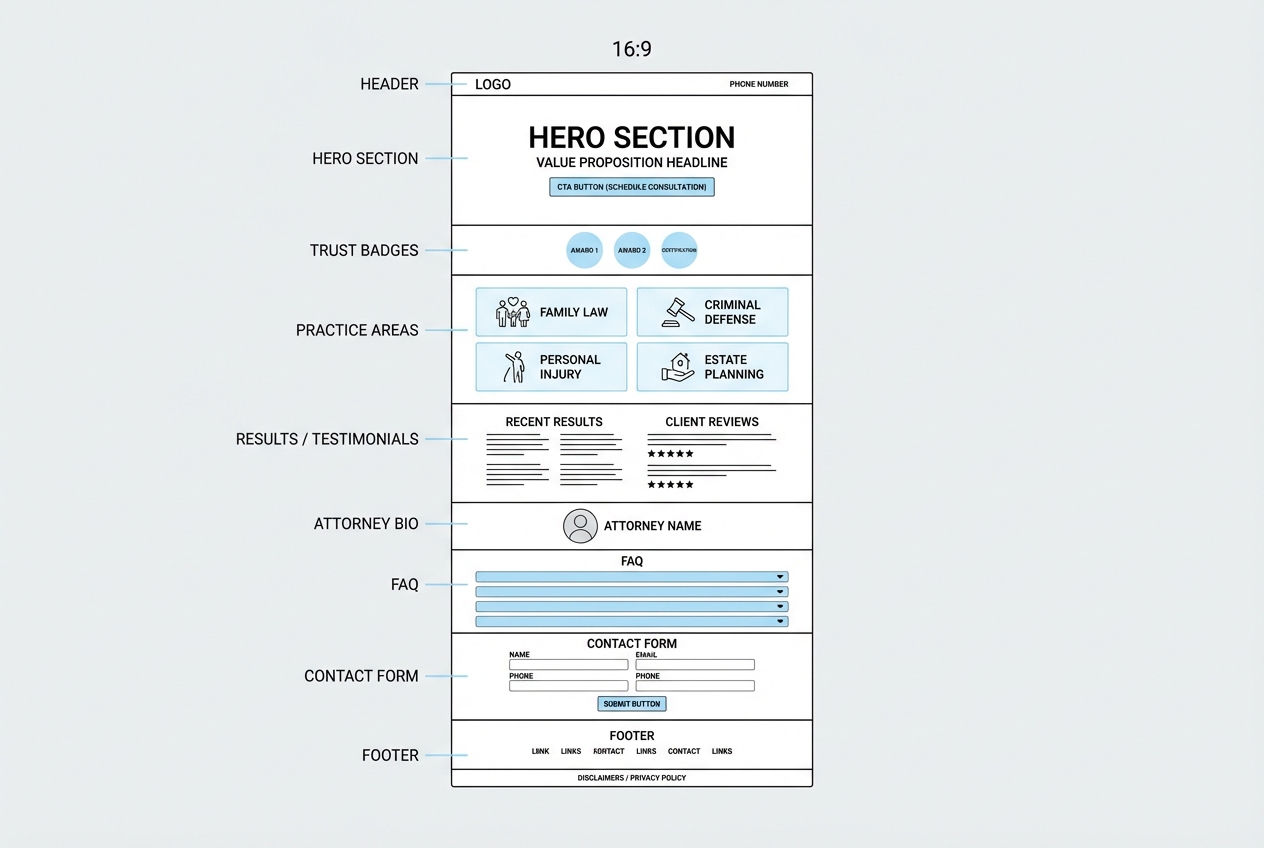
Page structure that consistently performs
A law firm landing page layout does not need to be novel. It needs to be clear.
A reliable order:
- Header: Logo, phone, optional "Free consult" label, minimal navigation.
- Hero: Situation + benefit + primary CTA.
- Trust badges: Jurisdictions, years in practice, review platform badges, associations.
- Practice fit: What you handle and what you do not handle.
- Proof: Testimonials, case summaries, credentials.
- Attorney section: Human credibility, not a resume dump.
- Process: What happens after they contact you.
- FAQ: Objections and screening.
- Contact: Form and alternate contact methods.
- Footer: Disclaimers, privacy basics, office info.
If you want a shortcut, start with a template and adjust only what changes conversion: offer, proof, and intake. In my opinion, overdesign is often just indecision.
SEO essentials for a law firm landing page
Even if the page is mainly for ads, you still benefit from solid on-page Search Engine Optimization (SEO). It also keeps your page reusable when you later want organic traffic.
Focus on the basics:
- Title tag and H1 alignment: Match the query and location naturally.
- One primary topic per page: Avoid stuffing multiple practice areas into one URL.
- Local relevance: Include your service area and office location details where appropriate.
- Internal linking: Help your site connect the dots between the landing page and deeper credibility pages.
Tracking, attribution, and follow-up that actually closes the loop
If you cannot answer "where did this lead come from?" you will keep guessing.
Set up measurement early:
- Call tracking numbers: Use dynamic number insertion for paid campaigns.
- Form event tracking: Track both submissions and "start form" events.
- Customer Relationship Management routing: Pass UTM parameters into your Customer Relationship Management (CRM) system.
Then fix the operational gap: intake follow-up.
- Speed-to-lead: Your follow-up system should be immediate and consistent.
- Routing rules: Send the right matters to the right person, not a generic inbox.
- Status visibility: Know which leads are new, contacted, scheduled, and disqualified.
This is where many firms end up duct-taping tools together. If you would rather build a simple internal intake app that matches your firm’s workflow, QuantumByte can help you generate it quickly, then refine it as you learn. The prompt templates in AI app builder prompts are a strong starting point for scoping what you need.
Common mistakes that quietly kill conversions
These are the issues that show up again and again on underperforming pages.
- Too many CTAs: When everything is important, nothing is.
- Generic headlines: "Experienced attorneys" does not match intent.
- Long forms with no payoff: If you ask for a lot, explain why and what happens next.
- Hidden phone number: If you want calls, show the number early and make it tap-to-call.
- No screening: A page that "accepts everyone" invites everyone.
- Unclear jurisdiction: Visitors need to know where you practice.
Recommended tool stacks for building and iterating
There is no single perfect stack. There is only the stack you can maintain.
A practical breakdown:
- Page builder: Webflow, WordPress, Unbounce, Wix.
- Scheduling: Calendly or similar (when consult booking is the goal).
- Forms and intake: Native forms, Typeform, or a custom intake workflow.
- Analytics: Google Analytics, ad platform conversion tracking, call tracking.
If you need more than a page, for example a client intake portal, document upload, or a lightweight matter qualification system, a general landing page builder starts to feel limiting. This is where an AI app builder becomes the more scalable option.
QuantumByte is strongest when you want speed plus customization: you can start with structured planning in Packets, then build the workflow app behind the landing page without rebuilding your stack later. If your firm needs deeper control, governance, or multi-team ops, the Enterprise offering is the clean upgrade path.
What to do next
A law firm landing page works when it is focused: one audience, one promise, one action. Build the page, measure it, then iterate with real lead quality data.
If you want to move faster than a traditional build cycle and avoid stitching five tools together, build the landing page and the intake workflow as one system. Start with QuantumByte Packets to turn your idea into build-ready structure, then generate the app from there: create your landing page.
Frequently Asked Questions
What should a law firm landing page include above the fold?
A clear headline that matches the visitor’s situation, one primary call to action, a visible phone number (tap-to-call on mobile), and at least one trust signal such as jurisdiction, location, or a short credibility cue.
How long should a law firm landing page be?
As long as it needs to be to answer the visitor’s top objections and make the next step feel safe. Higher-intent paid traffic usually needs less explanation. Lower-intent organic traffic often benefits from more FAQs and process clarity.
Can I list past case results on a landing page?
Often yes, but do it carefully. The ABA Model Rule 7.1 comment notes that truthful achievements can still be misleading if they create unjustified expectations. Check your local rules and add qualifying context.
What is the best call to action for a law firm landing page?
Use the next step your team can reliably deliver. For many firms, that is a phone call or a short "request a call back" form. If you offer booked consults, scheduling can work well, but only if you have capacity and fast confirmation.
Do I need to follow accessibility guidelines for a landing page?
Yes. Accessibility is part of good user experience and reduces friction for every visitor, not just those using assistive technology. Use the WCAG 2.2 quick reference as a practical standard when designing forms, contrast, and navigation.