
Your portfolio can be stunning and still fail to book clients if your photographer landing page does not answer one question fast: "Can you shoot what I need, on my date, at my budget?" This guide shows you how to build a landing page that converts, with the exact sections, copy patterns, and technical setup that help visitors take action.
What a photographer landing page must do to convert
A photographer landing page is a single, focused page designed to turn a visitor into a lead or booking. It works when it reduces uncertainty.
Aim for these outcomes:
- Clarify your niche fast: Visitors should immediately know what you shoot (weddings, headshots, product, real estate) and where.
- Prove quality quickly: Your best work should appear above the fold, with enough context to feel real.
- Make the next step effortless: One primary call to action (CTA), minimal friction, and a backup option for people not ready to book.
- Handle objections: Price expectations, turnaround times, deliverables, and availability should not be a scavenger hunt.
Choose one landing page goal and one audience
Most photographer landing pages underperform because they try to serve everyone.
Pick one:
- Book a consult or session: Best for service photographers (family, portraits, headshots).
- Request a quote: Best for weddings, commercial, and events.
- Join a waitlist: Useful for seasonal mini sessions.
- Download a guide: A strong option if your traffic is cold (social media, ads) and you need lead nurturing.
Then pick a single "primary visitor":
- Time-poor buyer: Needs instant clarity, pricing guidance, and a fast booking path.
- Comparison shopper: Wants portfolio depth, reviews, and clear differentiation.
- Referral lead: Wants confirmation you are legit, plus a simple way to contact you.
Once you choose, everything else is easier: the hero headline, the CTA copy, the order of sections, and what you can safely remove.
Photographer landing page structure that converts
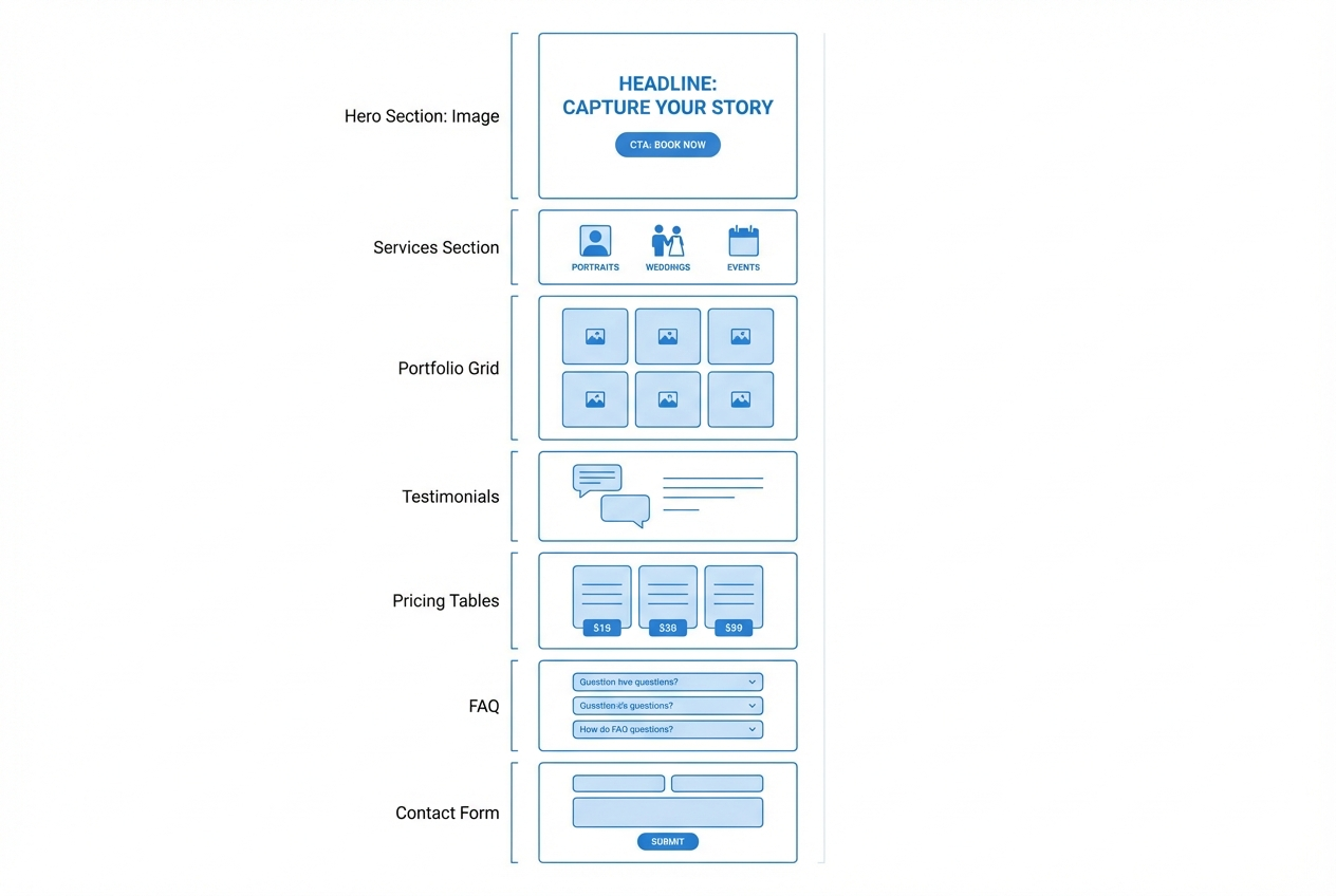
Use this order as your default. You can adjust, but do not reinvent the flow until you have data.
- Hero section: Your strongest image, a clear value proposition, and one primary CTA.
- Social proof: Reviews, badges, or recognizable client logos (only if real).
- Services snapshot: 3 to 6 offerings with outcomes, not just labels.
- Portfolio highlights: Curate by category, not by chronology.
- Your process: What happens after they reach out, in 3 to 5 steps.
- Pricing guidance: Starting prices, packages, or a "typical investment" range.
- Frequently asked questions: Remove friction around delivery, licensing, reschedules.
- Contact or booking: A short form or scheduler, plus a secondary contact method.
Write a hero section that answers the "why you" question
The hero is where most conversions are won or lost. Keep it simple and decisive.
A proven hero copy formula
- Headline: "What you do + for whom + in what location."
- Subheadline: One sentence on the outcome, style, or experience.
- Primary CTA: "Check availability" or "Book a consult."
- Secondary CTA: "See portfolio" for visitors not ready to talk.
Examples you can adapt:
- Product photography: "Clean, high-end product photography for Shopify brands in Austin."
- Wedding photography: "Natural, documentary wedding photography across the Bay Area."
- Executive headshots: "Modern executive headshots in Chicago, with same-week delivery."
Avoid vague claims like "capturing moments." Specificity is what makes a visitor feel understood.
Build a portfolio section that sells, not just displays
A portfolio grid should function as proof of fit and quality, not a catch-all gallery.
Use these principles:
- Curate the first 9 to 12 images: Lead with your best, most on-brand work. Weak images lower perceived quality.
- Group by buyer intent: Weddings, engagement, bridal, venue examples. Or headshots by industry. Or products by category.
- Add short context: One line per gallery can increase trust (venue, brief, constraints, result).
If you want to add deeper proof without clutter, link out to full galleries or a dedicated portfolio page.
Make it easy to book with scheduling and qualification
The fastest photographer landing pages to monetize are the ones that let a qualified lead move forward without waiting on email.
What works in practice:
- Short qualification form: Event date, location, shoot type, budget comfort, and how they found you.
- Scheduler for consults: A 10 to 15 minute call is enough to confirm fit.
- Clear boundaries: Business hours, travel range, and response time.
If you are ready to go beyond a static page, this is where a lightweight client system starts to pay off.
With QuantumByte, you can turn the landing page into a simple intake and booking flow without stitching together multiple tools. A practical starting point is the structured brief on the Packets page, which helps you define fields, automations, and the exact screens you need before you build.
If you want to move quickly, start by drafting your build spec using the prompt patterns in AI app builder prompts, then implement the booking flow as your first iteration.
Add social proof that reduces risk
Social proof should address the fear behind the purchase: "Will I regret this?"
Prioritize:
- Specific testimonials: Results, experience, delivery speed, communication.
- Before and after credibility cues: Publication features, awards, or years in business (only if accurate).
- Trust signals near CTAs: A short review snippet directly under "Check availability" can be enough.
When possible, include the client's first name and context (for example, "SaaS founder headshots" or "November wedding at [venue]").
Include pricing without scaring off good leads
Pricing guidance filters out bad-fit leads and makes good-fit leads feel safe. You do not need to publish every package to be transparent.
Strong options:
- Starting at pricing: A clear minimum for each shoot type.
- Typical investment range: Useful when projects vary.
- Package anchors: 2 to 3 packages with deliverables and usage rights.
Make sure pricing ties to outcomes:
- Deliverables: Number of edited images, prints, gallery access.
- Timeline: Proof gallery, final delivery window.
- Usage rights: Personal use, commercial usage, licensing.
Improve speed and search engine optimization basics for a photographer landing page
Photography sites are image-heavy, so performance and search visibility depend on a few fundamentals.
Optimize your images for performance
Use modern formats and intentional sizing.
- Use WebP where possible: According to web.dev, WebP images are often "on the magnitude of a 25–35% reduction in filesize" compared to JPEG and PNG, which can improve loading speed when used correctly in a responsive setup (Serve images in WebP format).
- Export the right dimensions: Do not upload 6000px images for a 1200px grid.
- Lazy-load below the fold: Let the hero load first.
Hit Core Web Vitals targets
Google's user experience metrics focus on loading, interactivity, and layout stability. web.dev defines Core Web Vitals thresholds as Largest Contentful Paint (LCP) of 2.5 seconds or less, Interaction to Next Paint (INP) of 200 milliseconds or less, and Cumulative Layout Shift (CLS) of 0.1 or less at the 75th percentile of page loads (Core Web Vitals).
For a photographer landing page, the hero image is frequently the Largest Contentful Paint element. If it is huge or uncompressed, you will feel it in both conversions and performance.
Make your images understandable to search engines
Use clear metadata and descriptions.
Google recommends using descriptive filenames and alt text, and also highlights adding structured data as part of optimizing for Google Images (Image SEO best practices).
Write alt text like a human would describe the image's intent, not like a keyword list.
Do accessibility basics correctly
Accessibility improves usability for everyone, and it also forces clarity.
The W3C Web Accessibility Initiative explains that informative images need text alternatives, decorative images should use a null alt attribute (alt=""), and functional images should describe the action they perform (Images tutorial).
Practical takeaway: portfolio images should have concise, descriptive alt text (for example, "Bride and groom walking out of the ceremony in downtown Seattle"). Decorative background textures should be alt="".
Turn your landing page into a simple client workflow
Once your landing page is converting, the next bottleneck is usually admin: intake, scheduling, proofing, approvals, and follow-ups.
A clean workflow looks like this:
- Inquiry intake: Form captures the essentials and routes by shoot type.
- Availability confirmation: Automatic email with next steps.
- Booking: Contract and invoice, then calendar confirmation.
- Proofing and approvals: A system for clients to review, request edits, and approve.
If proofing and sign-off is a pain point, the patterns in our guide to client review and approval software translate well to photography, especially if you want a professional approval experience without endless email threads.
This is also where QuantumByte is genuinely different from typical website builders. Squarespace, Wix, Webflow, and Format are solid for presentation. They become limiting when you want custom workflows that match how you run sessions. QuantumByte is built for founders and operators who want a landing page plus a tailored intake and operations layer on top.
To map that out quickly, start from the workflow patterns in automate business processes, then scope only the pieces that reduce your weekly admin load.
How to build your photographer landing page step by step
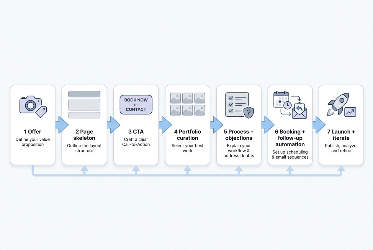
This is the build sequence that keeps you focused and prevents endless tweaks.
1) Draft your one-page offer
Write down your niche, location, and what a client gets.
- What you shoot: Be specific.
- Who it is for: Couples, founders, realtors, brands.
- What they walk away with: Edited gallery, commercial-ready assets, prints.
When you have this, your hero headline and services section almost write themselves.
2) Create the page skeleton before writing long copy
Lay out sections first, then fill in words.
A good skeleton prevents the common mistake of over-writing early. You will also see what is missing (often pricing guidance or process clarity).
If you like working fast with AI-assisted building, the frameworks in vibe coding tools are a useful mental model: get a functional version live, then iterate in short cycles.
3) Choose your primary CTA and make it visible
Pick one primary action and repeat it.
Good CTAs for photographers:
- Check availability: Strong for date-based services.
- Book a consult: Best for higher-ticket shoots.
- Request a quote: Best when scope varies.
Place the primary CTA in:
- Hero section: Make the decision easy in the first screen.
- After services: Catch visitors who are already convinced.
- After portfolio: Convert people once they've seen proof.
- After pricing: Capture high-intent leads once expectations are set.
4) Curate a tight portfolio slice
Select images that match your offer, not just your best overall work.
A wedding landing page should not lead with product shots. A brand photography page should not lead with family portraits. Relevance wins.
5) Add your process and objections
Your process section is where visitors decide if you are easy to work with.
Keep it to 3 to 5 steps. Example:
- Step 1: Share your date and goals.
- Step 2: Quick call to confirm fit.
- Step 3: Book with contract and retainer.
- Step 4: Shoot day.
- Step 5: Proof gallery and final delivery.
Then add a short Frequently Asked Questions section later to handle details.
6) Implement booking and follow-up
If you rely on manual follow-ups, your conversion rate is being capped by your inbox.
At minimum:
- Instant confirmation email: Sets expectations and confirms you received the inquiry.
- Follow-up sequence: One reminder if they do not book.
If you want the simplest path to a landing page plus booking and intake, build from the Packets workflow. For teams that need more governance and deeper customization, there is also QuantumByte Enterprise.
7) Ship, then iterate using real questions from leads
Launch when the page is clear and functional, not perfect.
Then improve based on:
- Top objections: Add them to Frequently Asked Questions.
- Common shoot types: Create dedicated landing page variants.
- Drop-off points: Move social proof higher or shorten your form.
If you are productizing your photography process into something you can sell or license, the strategy in white label app builder is a useful next read.
Common mistakes that quietly kill conversions
These are the issues that show up again and again.
- Bold claims without proof: Visitors trust galleries, reviews, and specifics more than superlatives.
- Too many CTAs: Multiple "Book now / Contact / Get a quote / Download" buttons dilute decisions.
- No pricing guidance: You end up with low-intent leads and longer sales cycles.
- Overloaded portfolio: More photos can reduce perceived quality if the average drops.
- Slow hero image: A gorgeous landing page that loads late loses impatient buyers.
Wrapping up what you now have
You now have a practical blueprint for building a photographer landing page that converts: a clear single-page goal, a proven section order, copy formulas for the hero, a portfolio that sells, and the technical basics that keep the page fast, accessible, and searchable.
If you want to go further than a static page and build the intake, scheduling, and proofing flow around it, QuantumByte is the most founder-friendly way to get there without turning your business into a software project. Start your build plan with a structured brief on QuantumByte Packets and use it to scope the exact workflow you want before you build.
Frequently Asked Questions
What is the best platform for a photographer landing page?
The best platform depends on whether you need only a brochure-style page or a workflow.
- Presentation-first: Squarespace, Wix, Webflow, and Format are strong when your needs are mainly design and content.
- Landing page plus operations: If you want custom intake fields, booking logic, and a connected client workflow, an AI app builder approach is often a better fit. QuantumByte is designed for that landing page plus system outcome, starting from a structured spec. You can get started creating a landing page today.
How long should a photographer landing page be?
Long enough to remove doubts, short enough to keep momentum. For most photographers, one page with 7 to 9 sections (hero, proof, services, portfolio, process, pricing guidance, frequently asked questions, contact) is the sweet spot.
Should I put pricing on my photography landing page?
Yes, in some form. A "starting at" price or a typical range filters out poor-fit leads and saves time. If your work is highly custom, use ranges and explain what drives cost.
What should my CTA be?
Choose a CTA that matches how clients buy.
- Weddings and events: For date-based work, "Check availability" is usually strongest.
- Commercial and high-ticket shoots: For higher-stakes projects, "Book a consult" often converts better.
- Variable-scope projects: For work where requirements change a lot, "Request a quote" can work if the form is short and clear.
What is the single most important section?
The hero section. If the visitor cannot quickly understand what you shoot, who it is for, and what to do next, they will not scroll far enough to see your best work.