
A pilates studio reporting dashboard should tell you, at a glance, which members are drifting toward cancellation, whether cash collection is quietly breaking, and where your schedule is capping growth before revenue drops.
Most studio software ships with “reports.” That’s not the same thing. Reports help you investigate. A dashboard helps you decide, fast.
The simplest model that works is:
- Leading indicators (behavior + billing) → predict
- Lagging outcomes (churn + revenue) → confirm
If your dashboard cannot answer these three questions every week, it is not doing its job:
- Who is at risk right now?
- What is working right now?
- Where are we capped right now?
What a Pilates studio reporting dashboard should do
A Pilates studio dashboard is not a “pretty summary.” It is an operating system.
A good one does three things reliably:
- Predict churn before it happens: Your best warning signs are behavioral (attendance patterns) and billing-related (payment failures), not last month’s cancellations.
- Protect collections: A member who wants to stay but can’t pay is still churn unless you recover the payment.
- Reveal capacity constraints: If your prime-time reformer schedule is full, you will feel “demand,” but revenue will flatline.
To make that possible, design for two speeds:
- Dashboard: 10–15 tiles, stable definitions, reviewed daily/weekly.
- Reports: Deep dives you click into after a tile turns red.
The key best practice: pick your leading indicators first, then let them roll up into outcomes. That prevents the classic studio argument: “Revenue is up, so we’re fine” while cancellation requests and failed payments are piling up.
Quick verdict: the 12 tiles to pin first
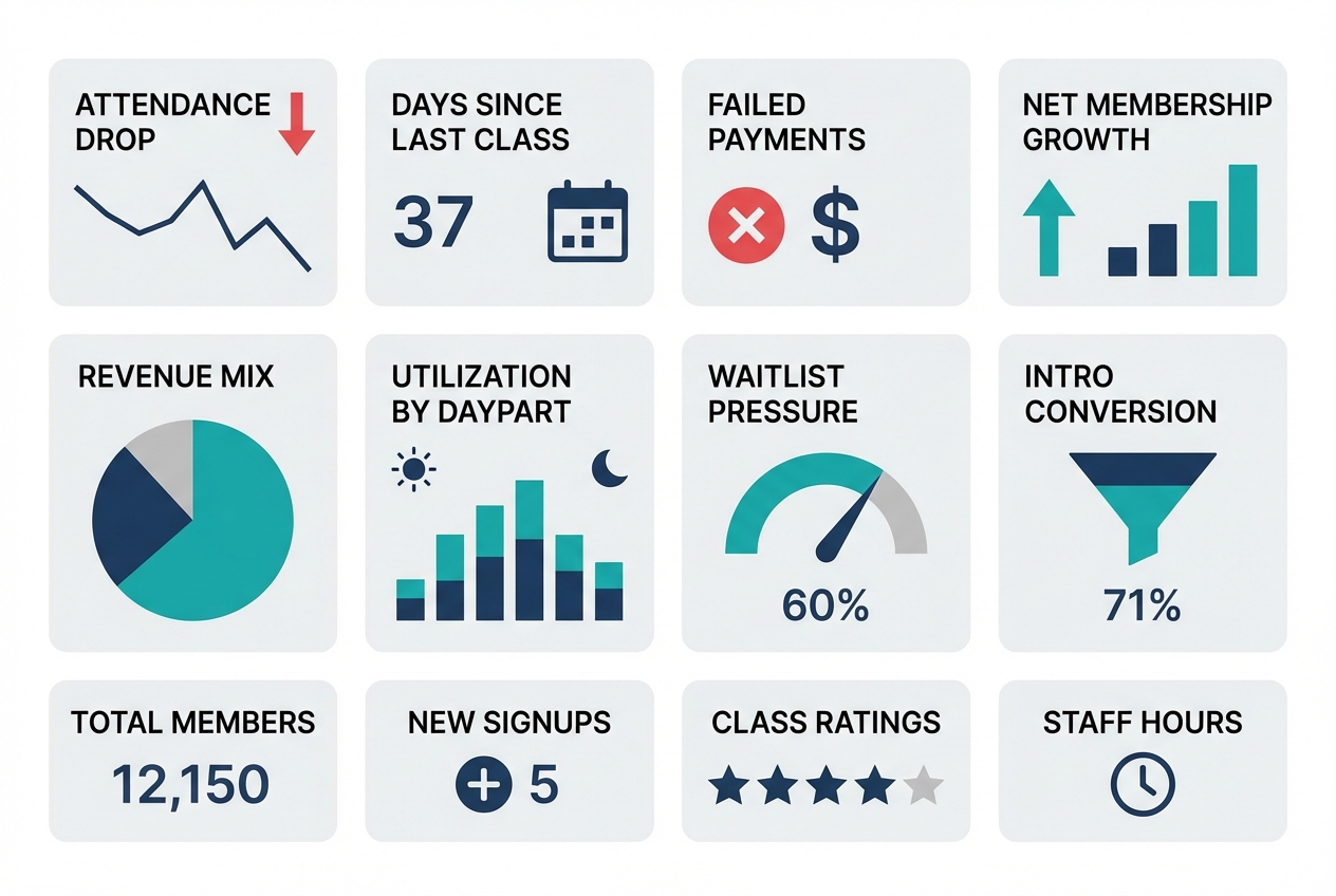
If you build nothing else, pin these 12 tiles. They cover retention risk, conversion, collections, and utilization. Each one includes a suggested window and the action it should trigger.
Retention risk
- Attendance drop rate (14-day vs prior 14-day): Trailing 28 days split into two halves. Action: generate an “at-risk outreach” list for anyone whose attendance fell by 50%+.
- Days since last class (by tenure band): Today. Action: trigger a win-back touch for new members hitting 7+ days and tenured members hitting 14+ days.
- Regular vs intermittent attendance mix: Trailing 8 weeks. Action: if “intermittent” grows, audit schedule friction and instructor substitutions. (This maps to research showing fitness attendance tends to separate into regular vs intermittent patterns, and barriers/stress predict attendance behavior, making attendance consistency a useful risk signal (PMC study).)
- Instructor affinity disruption: Last 30 days. Action: members who lost access to their top instructor get a proactive rebooking message.
Conversion funnel
- Lead → intro booked conversion rate: Last 7 days, plus trailing 28. Action: fix response time and booking friction if it dips.
- Intro booked → first visit show rate: Last 7 days. Action: tighten reminders and rescheduling pathways.
- Intro → membership conversion rate: Trailing 28 days, cohort-based. Action: adjust intro offer structure or first-3-classes experience.
Revenue and collections
- Net membership growth (starts, restarts, cancels, pauses): Weekly. Action: if cancels rise, drill into cancellation reasons and attendance drop cohorts.
- Revenue mix (memberships vs packs vs privates vs retail): Monthly-to-date and last full month. Action: spot dependence on promos or one-time packs.
- Involuntary churn risk (failed payments): Daily. Action: launch recovery sequence.
This is not optional. “Involuntary churn” is a real category in subscription businesses, and separating voluntary cancellations from payment-failure churn is standard practice because they require different fixes (Recurly).
Capacity and utilization
- Utilization by daypart and modality: Last 14 days. Action: add sessions where utilization is high and prune where it is low.
- Waitlist pressure and sold-out rate: Last 7 days. Action: expand high-pressure class types or add instructors.
Best practice for every tile: default filters you can toggle in one click.
- New vs tenured members
- Membership vs pack
- Reformer vs mat vs private
- Instructor
- Location (if multi-site)
KPI dictionary: exact definitions
Studios get stuck when “active member,” “retention,” and “churn” mean different things in different tools. Fix that by writing a KPI dictionary once, then reusing it everywhere.
The goal is consistency, not perfection.
| KPI | Definition / formula | Window | Recommended segments | Primary owner | Common misread |
|---|---|---|---|---|---|
| Active member | Member with an active membership OR a class-pack purchase within last 60 days | Rolling | Membership vs pack | GM | Confusing “has account” with “active” |
| Engaged member | Attended ≥2 classes in last 14 days | Rolling | Tenure bands | Head coach | Treating 1 class as engagement |
| At-risk member | Meets at-risk score threshold (see rubric below) | Rolling | New (0–30), 31–90, 90+ days | GM | Using cancellation request as the first signal |
| Attendance drop rate | % of members with attendance in last 14 days less than half of prior 14 days | Rolling | Tenure, modality | GM | Comparing week-to-week without smoothing |
| Voluntary churn rate | Voluntary cancellations during period ÷ starting active members | Monthly | Tenure, plan | Owner | Mixing cancels and payment failures |
| Involuntary churn rate | Members lost due to payment failure ÷ starting active members | Monthly | Plan, payment method | Ops/finance | Treating as “bad members” instead of fixable process |
| Retention (cohort) | % of a start cohort that is still active after N weeks | Weekly curve | Acquisition channel, intro type | Owner/marketing | Using a single month “retained” snapshot |
| Intro conversion | New members started within 14 days of intro completion ÷ intros completed | Rolling | Modality, instructor | Sales/GM | Counting “purchased a pack” as “converted” if your goal is recurring |
| Time-to-first-class | Median days from purchase/booked intro to first attended class | Rolling | New leads, new members | Front desk | Ignoring, then wondering why conversion is low |
| Utilization | Filled spots ÷ available spots | Weekly | Modality, daypart, instructor | GM | Averaging across all classes and hiding peaks |
| Effective revenue per attendance | Total class revenue ÷ total attended classes (exclude taxes) | Monthly | Membership vs pack | Owner | Comparing to list price without adjusting for comps/discounts |
Retention terminology
Cohort retention is where studios accidentally lie to themselves.
Define a cohort start event, then pick a retention logic and stick to it. Mixpanel’s retention reporting is a clean reference for the two most common approaches: being active “On” a specific period versus “On or After” that period (Mixpanel retention docs).
In studio terms:
- “On” retention: did a member attend in week 4 exactly?
- “On or After” retention: did a member attend at any point in week 4 or later?
For Pilates memberships, “On or After” usually matches reality better because people travel, get sick, and then return. But you should also track “On” attendance for early cohorts because it exposes friction in the first 2–4 weeks.
Churn definitions
Use two churn buckets because the fixes are different:
- Voluntary churn: member chooses to cancel.
- Involuntary churn: member is lost because payment fails.
This split is a standard benchmark framing in subscription analytics (Recurly). In a studio, involuntary churn is often avoidable with better recovery and better payment-update flows.
Churn early-warning layer: leading indicators that actually predict cancellations
A churn tile that only counts cancellations is a post-mortem. You need a warning layer that surfaces drift early enough to intervene.
1) Attendance frequency drop
Use a two-period comparison because it is stable and easy to explain to staff.
- Rule: flag members whose attended classes in the last 14 days dropped by 50%+ compared to the prior 14 days.
- Segment by tenure: new members (0–30 days) behave differently than tenured members.
Actions to attach to the tile:
- For new members: message within 24 hours. Offer a specific next booking, not a generic “we miss you.”
- For tenured: check schedule/instructor disruption first, then reach out.
2) Regular vs intermittent pattern detection
The win is not predicting exact cancellations. The win is catching when a previously regular member becomes intermittent.
Research on fitness-center attendance shows people often fall into regular vs intermittent patterns, and barriers and stress strongly influence attendance behavior (PMC study). That makes pattern drift a reasonable leading indicator.
A practical dashboard implementation:
- Compute each member’s baseline: average weekly attendances across the last 8 weeks.
- Flag drift: last 2 weeks are 30%+ below baseline.
This avoids punishing naturally intermittent members while still catching “something changed” for regulars.
3) Class affinity and instructor affinity
Many cancellations are not “pricing.” They are “my favorite class moved” or “the instructor I loved is gone.”
Track two ratios per member:
- Class-type share: % of their last 10 attendances that were reformer, mat, or private.
- Instructor share: % of their last 10 attendances with their top instructor.
Then alert when:
- Their top class type disappears from the schedule they can attend.
- Their top instructor share drops by half.
The playbook is operational:
- Offer a swap path: “If your 6pm reformer is full, here are two alternatives this week.”
- For instructor changes: introduce a replacement early, not after the member drops.
4) Payment failure monitoring
Failed payments create churn that looks like a member decision but is often just a card issue. Stripe calls out failed payments as a major subscription risk and outlines recovery tactics like smart retries, reminders, grace periods, and easy payment-update flows (Stripe).
Dashboard tiles to include:
- Failed payment rate: failed charges ÷ attempted charges (daily and weekly).
- Recovery rate: recovered within 7 days ÷ failed payments.
- Aging: count of accounts 1–3, 4–7, 8–14 days past due.
Attach an action:
- Day 0–1: automatic retry + email/SMS to update payment.
- Day 3–7: staff task to call or personally message.
- Day 8+: freeze booking until updated, with a clear path to restore.
5) At-risk score rubric
This is where most vendor dashboards stop. Add a single calculated field that creates a prioritized outreach queue.
At-risk score (0–10) example:
- Attendance drop (0–4): 4 points if 50%+ drop last 14 vs prior 14; 2 points if 25–49% drop.
- Days since last class (0–2): 2 points if 14+ days; 1 point if 7–13 days.
- Payment issue (0–3): 3 points if failed payment not recovered within 3 days; 1 point if recovered but repeated twice in 30 days.
- Affinity disruption (0–1): 1 point if top instructor or modality unavailable in the next 7 days.
Flag thresholds:
- 7–10: immediate outreach today
- 4–6: outreach this week
- 0–3: monitor
Best practice: the score should always be clickable to a member list with the specific reason fields visible. Otherwise staff will ignore it.
Revenue drivers view: what to track beyond total sales
Total revenue is a result, not a lever. Your dashboard should explain why it moved and what to do next.
Track revenue as a mix, not a number
Break revenue into separate tiles so you can see what is driving change:
- Memberships
- Class packs
- Private sessions
- Intro offers
- Retail (if meaningful)
Then add one “quality” metric:
- Effective revenue per attendance: total class revenue ÷ attended classes
This helps you spot discount leakage. If attendance rises but effective revenue per attendance falls, you are buying growth with promos.
Net membership growth decomposition
A single “active members” line chart hides the story. Split it:
- New starts
- Restarts (previous members returning)
- Voluntary cancels
- Involuntary churn (payment failure)
- Pauses
Now you can act. If starts are fine but restarts are collapsing, your win-back program is weak. If involuntary churn is climbing, collections is your bottleneck.
Cohort-based revenue proxy
You do not need a perfect lifetime value model to make decisions. You need a consistent cohort revenue view.
For each “new member start” cohort (weekly or monthly), track:
- Revenue from that cohort in first 30 days
- Revenue in days 31–60
- Revenue in days 61–90
Pair this with a retention curve so you can see whether revenue is dropping because fewer people stay, or because people stay but buy less.
Capacity and utilization: the hidden ceiling on growth
Many studios think they need more marketing when the real problem is that the schedule cannot absorb demand.
Utilization that actually helps you schedule
Use this definition:
- Utilization = filled spots ÷ available spots
Then slice it the way decisions are made:
- Daypart (6–9am, 9–12, 12–4, 4–8)
- Modality (reformer, mat, private)
- Instructor
Add two leading signals:
- Sold-out rate: % of classes that hit 100%
- Waitlist pressure: average waitlist count for sold-out classes
If utilization is high and waitlists are growing, you have a growth constraint. If utilization is low, you have a positioning or scheduling problem.
Conversion lost to capacity
Add tiles that catch “silent lost sales”:
- Cancelled bookings due to full classes
- Unbooked intros (leads that tried to book but did not find a slot)
- Time-to-first-class (for new members)
This is where studios with strong demand often leak growth.
Example dashboard layouts
These are not wireframes. They are tile orders you can copy.
Owner weekly dashboard
Tile order:
- Net membership growth decomposition
- Voluntary vs involuntary churn
- At-risk member count (score 7–10)
- Attendance drop rate (50%+)
- Intro → membership conversion (trailing 28)
- Revenue mix (month-to-date)
- Effective revenue per attendance
- Utilization by daypart and modality
- Waitlist pressure
Filters to pin:
- Modality tab: reformer / mat / private
- Tenure: 0–30 / 31–90 / 90+
Top decisions it supports:
- Whether to expand schedule or shift instructors
- Whether churn is primarily cancellations or collections
- Whether to change intro offer or first-month experience
Threshold highlights:
- At-risk count up 20% week-over-week
- Involuntary churn rising for two consecutive weeks
- Utilization above 85% in prime dayparts with waitlists
Front desk daily dashboard
Tile order:
- Failed payments today + aging buckets
- Today’s utilization by class
- Tomorrow’s utilization by class
- No-show rate (7-day)
- Instructor substitutions next 7 days
- At-risk members needing outreach today (score 7–10)
Top decisions it supports:
- Who to call/text today
- Which classes need last-minute fill
- Which members need payment updates before they show up
Multi-location executive rollup
Tile order:
- Net growth by location
- Voluntary churn by location
- Involuntary churn by location
- Utilization by location (prime dayparts)
- Intro conversion by location
Best practice: every tile must be drillable into the exact member list or class list that explains the number. Otherwise “rollup” turns into “argue in Slack.”
Operating cadence: daily, weekly, monthly review that prevents surprises
Dashboards only work when they change what your team does.
Daily
- Payment failures: clear the oldest items first.
- Today/tomorrow utilization: fill gaps, manage waitlists.
- No-shows: identify repeat no-shows and tighten reminders.
Done means:
- Every failed payment has a next action and owner.
- Every low-fill class has a plan (promo push, consolidation, or instructor change).
Weekly
- At-risk list review: work the score 7–10 list first.
- Intro funnel: lead → booked → attended → converted.
- Schedule optimization: add where demand is proven, prune where it is consistently weak.
Done means:
- At-risk outreach is completed and tracked.
- One schedule change is decided, not “discussed.”
Monthly
- Cohort retention curve: see where new members fall off.
- Revenue per cohort: 30/60/90-day cohort revenue.
- Instructor trends: utilization and conversion impact.
Done means:
- You choose one retention experiment for the next month (for example: a 3-class onboarding track for week-1 members).
Data sources and integrations to plan for
Your dashboard is only as good as its data model.
Common data sources in a Pilates studio:
- Studio management system: classes, attendance, memberships, packages
- Payments processor: charges, failures, retries
- Marketing/CRM: leads, campaigns, sources
- Accounting: revenue categories and reconciliation
- Forms/waivers: onboarding milestones
Best practice: define a single “source of truth” for each metric, then compute consistent calculated fields in one place. Google’s Looker Studio documentation is clear on what a data source is and why it matters for consistent definitions (Looker Studio).
Data hygiene requirements to bake in early:
- Stable member IDs across systems
- Status history (start, pause, cancel, restart) rather than only “current status”
- Cancellation reasons captured as structured fields
- Intro offer tagging that survives upgrades and plan changes
Feature checklist for Pilates studio reporting dashboards
Use this list to evaluate studio software dashboards, BI tools, or a custom build.
Must-haves:
- Configurable tiles: You can pin the 12 tiles above without hacks.
- Cohort retention reporting: Not just “active members.”
- Member-level drilldowns: Every red tile leads to a list you can act on.
- Segmentation: Tenure, modality, instructor, location.
- Alerts: Scheduled email or notifications for payment failures and at-risk score spikes.
- Export/API: You can pull data if you outgrow the built-in UI.
- Role-based access: Front desk sees tasks; owner sees strategy.
Nice-to-haves:
- Multi-location rollups: With drilldown.
- Anomaly detection: Flags unusual drops.
- Embedded playbooks: Recommended actions per alert.
Anti-features (avoid these):
- Locked metric definitions: You cannot change “active” or “churn.”
- Totals without drilldown: Pretty, useless.
- Churn without a split: No way to separate voluntary vs payment-failure churn.
- No change history: You cannot explain why numbers moved.
Build vs buy: when to customize your dashboard
Buying is fine when your studio is simple and your team can live with the defaults.
Choose “buy” when:
- You are single-location
- You have one main product line
- Your software’s dashboard already supports cohorting, segmentation, and member drilldowns
Build (or customize) when:
- You need an at-risk score that blends attendance + payment signals
- You want automated task lists (call/text queues) linked to the dashboard
- You run multiple locations and need consistent definitions across them
- You sell multiple modalities (reformer, mat, privates) and need clean segmentation
Where Quantum Byte fits is the middle path: a custom internal dashboard app and workflows without paying for bespoke development. If you can describe the tiles, filters, and drilldowns you want, you can generate an MVP quickly, then iterate. The practical first build is not “everything.” It is:
- KPI dictionary layer (definitions locked and shared)
- 12-tile MVP dashboard
- At-risk scoring and a member outreach queue
That combination is what turns analytics into retention work.
Implementation timeline: from raw data to a working dashboard
A realistic path that avoids boiling the ocean:
-
Week 1: KPI definitions + data audit
- Write your KPI dictionary.
- Verify member IDs, status history, and payment failure fields.
-
Week 2: MVP dashboard (12 tiles) + drilldowns
- Build the tiles.
- Make every red tile clickable to a member list or class list.
- Run the weekly cadence manually.
-
Weeks 3–4: cohorts, at-risk scoring, alerts
- Add cohort retention and 30/60/90 cohort revenue.
- Implement at-risk score as a calculated field.
- Add alerts for payment failures and utilization caps.
-
Ongoing: tighten instrumentation
- Improve cancellation reason capture.
- Tag intro offers cleanly.
- Tune thresholds to match your studio’s reality.
What to do next: copy this spec and ship an MVP dashboard
If you want a dashboard that actually reduces churn, build it around leading indicators and attach actions to every tile.
Minimum viable spec:
- The 12 tiles (risk, funnel, collections, utilization)
- A KPI dictionary so definitions stay consistent
- An at-risk score that produces a prioritized member list
- A daily/weekly cadence with clear ownership
Then choose your path:
- Configure your existing studio software if it supports the definitions and drilldowns.
- Overlay a BI tool if your data is clean and centralized.
- Build a custom internal dashboard if you need a real churn early-warning system and automated workflows.
Start building a custom Pilates KPI dashboard
If you want the churn early-warning layer (attendance drift + payment failure risk) and a member-level outreach queue in one place, consider building a lightweight internal app in Quantum Byte.
Start with Quantum Byte to:
- Launch fast: Use plug-and-play templates for dashboards, client workflows, and common studio operations.
- Customize without a long dev cycle: Adjust KPIs, outreach queues, and automation logic by describing what you want.
- Scale like a real product: You are not locked into someone else’s roadmap.
Start with the MVP: the 12 tiles plus the at-risk member queue. Then iterate once you see which signals actually move your cancellations and cash collection.
If you are weighing customization, use a simple build vs buy test: if your churn prevention depends on a blended at-risk score and staff workflows, you will outgrow “default reports” fast.
When you are ready to price it out, start with the entry-level platform tier for the MVP, and move to the enterprise tier if you need deeper integrations, multi-location governance, or more complex permissioning.