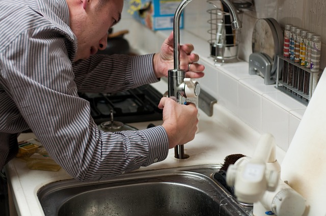
If your ads, Google Business Profile, or referrals are sending people to a generic homepage, you are probably leaking calls. A high-performing plumbing landing page fixes that by doing one job: turning a local visitor with a real problem into a booked job with minimal friction.
Plumbing landing page basics that actually move the needle
A plumbing landing page is a single-purpose page built for one conversion, usually a phone call, a quote request, or a booking.
What makes it different from a normal website page:
- One intent per page: Match a specific need (emergency plumber, drain cleaning, water heater repair) instead of listing everything.
- One primary action: Make the next step obvious, with one dominant call to action (CTA) and supporting options.
- Message match: The headline and first screen should mirror the wording someone clicked from an ad or search result.
- Trust fast: Licensing, reviews, service area, and pricing signals must be above the fold.
If you want a useful mental model, think "ad group or keyword in, booked job out."
Pick your conversion goal before you write a word
Your landing page will convert better when you commit to one primary conversion and design everything around it.
Here are the most common conversion goals for plumbing:
- Phone call: Best for emergency jobs and high-intent searches. You want tap-to-call, clear hours, and a short reassurance line.
- Request a quote form: Best for planned work like water heaters, repipes, remodel rough-in, and "compare options" shoppers.
- Schedule online: Best when you can offer defined appointment windows and you have a process to confirm quickly.
A simple way to decide:
| Traffic intent | Best primary CTA | Why it fits |
|---|---|---|
| Emergency (burst pipe, no hot water) | Call now | Speed beats everything. People do not want to wait for a quote. |
| Service (drain cleaning, leak repair) | Call now or Get quote | Many still prefer calling, but forms work if your response time is tight. |
| Install (water heater, filtration) | Get quote | They want price range, options, and proof you are legitimate. |
| Commercial / multi-site | Request consultation | Longer sales cycle, needs qualification and documentation. |
If you run pay-per-click (PPC) ads, treat this as non-negotiable: the page has to match the ad, load reliably, and make the next step obvious. That alignment is what improves lead quality and keeps acquisition costs from drifting upward.
Map a plumbing landing page layout that converts
A strong plumbing landing page is predictable in a good way. People are anxious, often dealing with property damage, and they want to make a safe decision fast.
Top bar
Put your phone number, a clear "Call now" action, and your service area at the very top. The why is simple: on mobile, the first screen is your best chance to capture a high-intent call. The outcome you want is one-tap access to help, without scrolling.
If you truly offer 24/7 service, say it here. If you do not, be precise about hours so you do not burn trust.
Hero section
Lead with a clear promise tied to the visitor's intent, then support it with one line that reduces anxiety. This works because stressed homeowners are not comparing brands, they are checking for competence and urgency. The outcome is immediate clarity: "Yes, this is the right plumber for my problem in my area."
Trust strip
Add quick proof points right under the hero: licensed/insured, years in business, financing, same-day availability, or warranty language (only when true). The why is that visitors are doing a snap-risk assessment. The outcome is fewer bounces and fewer "Are you legit?" calls.
Services grid
Offer 4 to 8 scannable tiles that match your most common search intents (emergency plumbing, drain cleaning, leak detection, water heater repair). The why is message match: people want to see their exact issue reflected back to them. The outcome is faster self-selection and more confident clicks.
Emergency band
Include a high-contrast section dedicated to urgent situations. Spell out what to do now and what response looks like. The why is that emergencies have a different decision pattern. The outcome is more calls from your highest-value, highest-urgency traffic.
Reviews
Show 3 to 6 recent reviews that mention the specific service. This matters because generic praise does not reduce risk. The outcome is trust that feels local and relevant, not like a templated marketing claim.
Your process
Explain your workflow in three short steps (for example: call, diagnose, fix). The why is that homeowners want to know what happens after they reach out. The outcome is less uncertainty and fewer abandoned forms.
Service area
List the cities and neighborhoods you serve and clarify any travel fee policy if you have one. The why is that coverage uncertainty kills conversions. The outcome is fewer wasted inquiries and a higher percentage of qualified leads.
FAQ
Answer the objections that stall action: pricing, arrival windows, warranties, what counts as an emergency, and what happens after hours. The why is that a good FAQ removes friction without forcing a call. The outcome is more conversions from cautious shoppers.
Final CTA block
Repeat the primary action with a short reassurance line. The why is that people decide at different points on the page. The outcome is a clean "next step" for anyone who is ready now.
If you already have a broader website, keep it. Just route high-intent traffic to a dedicated page so your ad intent and on-page content stay aligned.
Write copy that matches how plumbing customers search
Your copy does not need to be clever. It needs to be specific.
Start with a headline that mirrors intent:
- Emergency service headline: "24/7 Emergency Plumber in [City]"
- Same-day service headline: "Drain Cleaning in [City], Same-Day Appointments"
- Install and repair headline: "Water Heater Repair and Replacement in [City]"
Then add one sentence that reduces anxiety:
- Trust and pricing reassurance: "Licensed and insured. Upfront pricing before work starts."
- Human pickup reassurance: "Call now and talk to a plumber, not a call center."
- Speed reassurance: "We can usually arrive the same day for urgent issues."
Below the fold, write for decision-making, not browsing:
- Symptoms people recognize: Explain the problems in the customer's language, like "gurgling drains," "water under sink," "no hot water," or "toilet keeps running," so they feel understood.
- What you will do: Describe the actual work at a high level (camera inspection, clearing the line, replacing a valve, diagnosing the heater) to set realistic expectations.
- What to expect: Clarify response time ranges, how estimates work, and what warranty terms apply, so the customer can say yes without guessing.
Avoid filler like "We are the best plumbers." Replace it with proof and a clear next step.
Build trust in the first 10 seconds
A plumbing landing page fails when it feels anonymous or vague.
Include trust elements that are easy to verify:
- License and insurance: State what you are (licensed, insured, bonded) and keep it accurate.
- Real location signals: Service area list, map embed, and local phone number.
- Review highlights: Use service-specific reviews, not generic "great company" quotes.
- Guarantees and warranties: Only if you honor them consistently.
Use bullets to make it scannable:
- Upfront pricing: Explain that you confirm the scope and price before starting, so the customer is not guessing.
- Background-checked techs: Clarify what your screening process is (even if it is basic), because trust is the product in home services.
- Clean work policy: Mention shoe covers, cleanup, and respect for the home. This matters more than most plumbing companies think.
Make the mobile experience feel effortless
Most urgent plumbing leads happen on a phone. Design like you expect thumbs, not mouse clicks.
Priorities that improve conversions:
- Tap-to-call everywhere: Use a sticky button that stays visible.
- Short form fields: Name, phone, zip/city, issue description. That is enough to start.
- Big spacing: Buttons should be easy to tap and visually distinct.
- No slow sliders: Avoid carousels, heavy animations, and giant galleries.
A good rule: if someone cannot call or request service in under 15 seconds, you are making them work too hard.
Offer framing that increases "yes" without cheap discounts
Discounts are optional. A credible offer is what actually increases conversions.
High-performing plumbing offers tend to be:
- A clear next step, not a gimmick: "Free phone assessment," "Same-day availability," "Upfront estimate."
- Risk reduction: "No work starts without approval," "Warranty included," "Financing available."
- Emergency clarity: "24/7 response line" (only if staffed).
Make the offer visible near your primary CTA, and repeat it in the last CTA block.
Add local search engine optimization elements without turning the page into a directory
You want relevance for both humans and search engines.
Use light, natural location signals:
- Service area section: List the main city and 6 to 15 nearby areas.
- On-page wording: Work local phrases into headings where it reads naturally (for example, "Emergency plumber in [City]").
- Consistent business info: Name, address (if you serve customers at a location), phone number, and hours.
Do not stuff 50 suburbs. It reads spammy and can reduce trust.
If you need help thinking through how intent becomes a real page plus a real intake flow, our guide on how an AI app builder works is a useful reference for planning requirements before you build.
Speed, stability, and landing page compliance
A slow page costs you leads.
Two practical guardrails:
- Measure with PageSpeed Insights: web.dev explains how PageSpeed Insights uses Lighthouse audits and Chrome User Experience Report data to show both lab diagnostics and real-user signals.
- Reduce layout shifts and tap delay: web.dev's overview of Core Web Vitals explains the experience signals behind loading, interactivity, and visual stability.
If you run ads, keep the destination functional across devices. Broken buttons, dead phone links, or forms that fail on mobile are conversion killers, and they are entirely avoidable.
Tracking that tells you what is actually working
If you cannot measure calls and form submissions, you will end up guessing.
Track at least these events:
- Calls from the page: Use a dedicated tracking number (or dynamic number insertion) so you can attribute calls by source.
- Form submissions: Fire a conversion event on successful submit.
- Click-to-call taps: Track as an event even if the call does not connect.
And keep a simple lead quality loop:
- Source → job type → revenue: Even a basic spreadsheet helps you see which keywords and pages are worth doubling down on.
Common plumbing landing page mistakes to avoid
These show up constantly in home services, even in expensive builds.
- Multiple competing CTAs: If you ask someone to "Call," "Chat," "Email," and "Browse services" at the same time, many will do none.
- No service-area clarity: Visitors hesitate when they cannot tell if you cover their neighborhood.
- Generic stock copy: "We are the best" does not answer "Will you pick up the phone and show up?"
- Slow media: Massive images and video backgrounds can wreck performance.
- Form overload: If you require 10 fields, you are filtering out good leads.
Building your plumbing landing page faster with QuantumByte
If you want a landing page that is tightly tied to how your business operates, not just how it looks, an AI app builder can remove a lot of setup time.
QuantumByte is designed for founders and operators who need working software quickly, without getting stuck in a long agency cycle. It is especially useful when your "landing page" is not just marketing, but the front door to a workflow.
Here are practical ways it can help:
- Turn your offer into a spec before you build: Our various Pricing packages forces clarity about services, service areas, CTAs, and intake questions, so you do not rebuild later.
- Add real operations behind the page: Instead of a form that emails you, you can route requests into a lightweight internal tool, with statuses, assignment, and follow-up reminders.
- Scale into a client-facing portal when you are ready: For larger jobs, a portal can reduce back-and-forth by sharing quotes, approvals, and scheduling. The mechanics are similar to the approach in this customer portal guide.
If you are ready to turn your plumbing landing page into something that also handles intake and follow-up, you can start with a structured build spec with our simple plans
For teams that need tighter controls, custom integrations, and more complex workflows, the Enterprise option is the better fit.
What a good "done" looks like
Before you push traffic, sanity-check the page against outcomes, not aesthetics.
A strong plumbing landing page:
- Matches intent immediately: The headline, service, and city are clear above the fold.
- Creates trust fast: Reviews, licensing, and clear policies are visible without scrolling forever.
- Makes action easy on mobile: Tap-to-call and a short form work without friction.
- Loads reliably: It measures well in real-world performance tools and does not jump around as it loads.
- Is measurable: You can attribute calls and forms to sources and campaigns.
If you want more frameworks like this for building practical software and workflows (not just pages), the QuantumByte Articles hub is a solid library. And if you want to understand the philosophy behind "build fast, but build responsibly," the Manifesto is worth reading.
Frequently Asked Questions
What should be on a plumbing landing page?
A plumbing landing page should include a clear service promise, a primary CTA (usually call now), trust signals (reviews, licensing, insurance), a short service list, service area coverage, and a frictionless way to request service on mobile.
How long should a plumbing landing page be?
Long enough to answer the obvious questions that block action, but not so long that the primary CTA gets buried. In practice, one strong screen above the fold plus 5 to 8 supporting sections is a reliable range.
Should I make separate landing pages for each plumbing service?
Yes, when you have distinct intent and keywords (emergency plumbing vs drain cleaning vs water heater replacement). Separate pages improve message match, conversion rates, and paid search efficiency.
Do I need a booking calendar on the landing page?
Not always. For emergency work, calls convert better. For planned installs and non-urgent service, booking can work well if you confirm quickly and keep scheduling options simple.
Can QuantumByte build more than a landing page?
Yes. If your goal includes intake, job statuses, follow-ups, and client approvals, QuantumByte can extend beyond a marketing page into a lightweight operations app, so leads do not disappear into a messy inbox.